Zpoptoys is an European online retailer specializing in merchandise from acclaimed films, television shows and comics. They offer a wide selection of action figures, toys, board games, and collectibles, ensuring that collectors and fans alike can discover the perfect new addition to their collection.
- Brand
- 2023
-
![ZpopToys]()
-
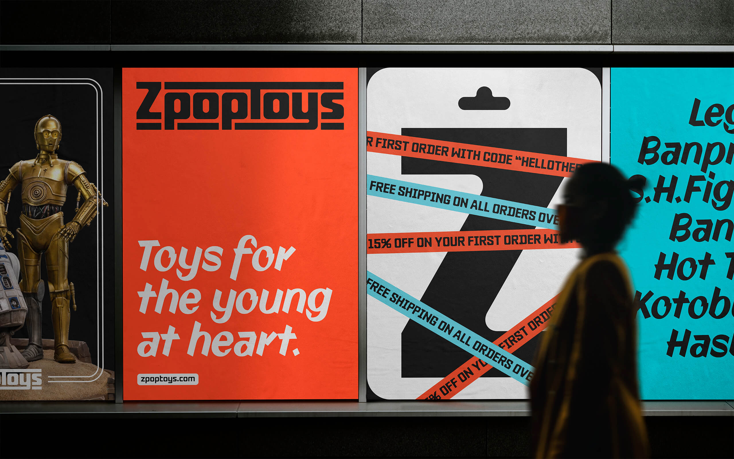
With a subtle retro accent, ZpopToys' branding strikes a balance between nostalgia and modernity, appealing to everybody's inner child while also representing the brand's forward-thinking and joyful spirit.
-
Reminiscent of sale signs from the 1960s and 1970s, a classic marker typeface is employed for body text and price tags. This choice seamlessly blends with the typeface used for titles and highlights, creating a harmonious blend of retro-futuristic aesthetics.
-
![ZpopToys]()
-
![ZpopToys]()
-
![ZpopToys]()
-
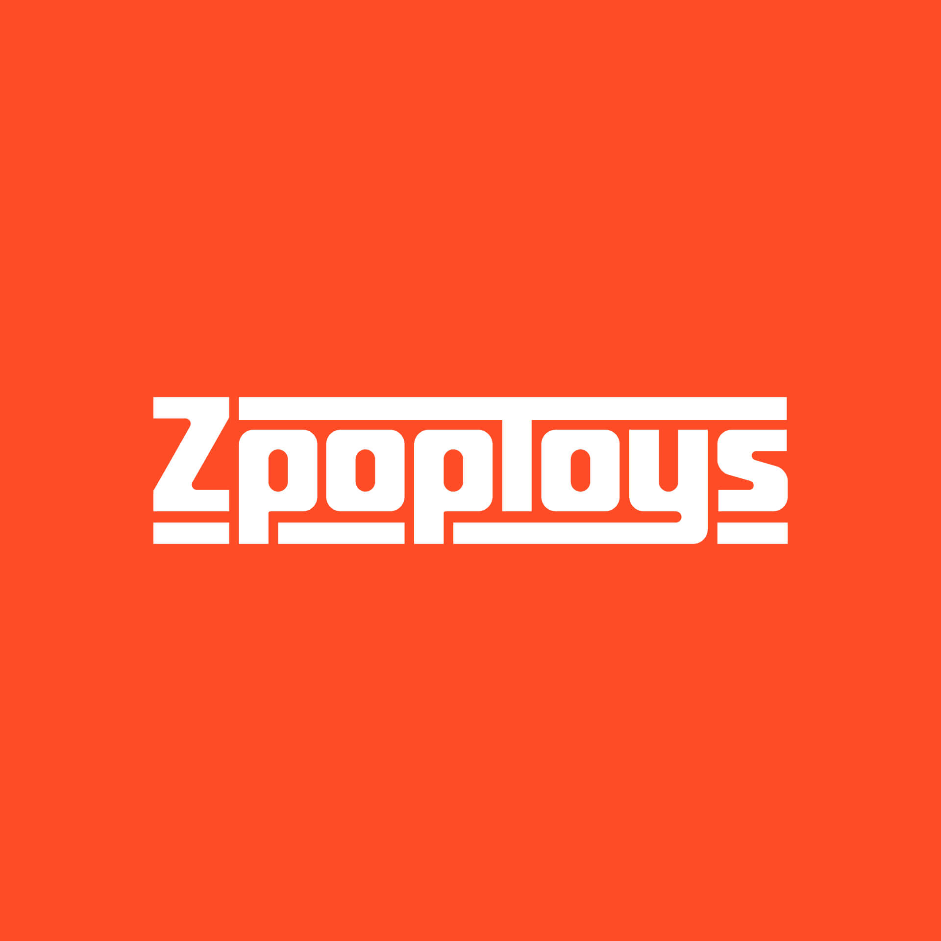
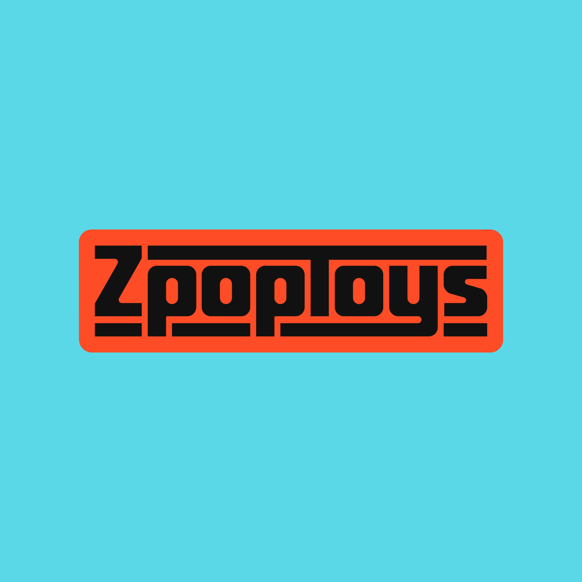
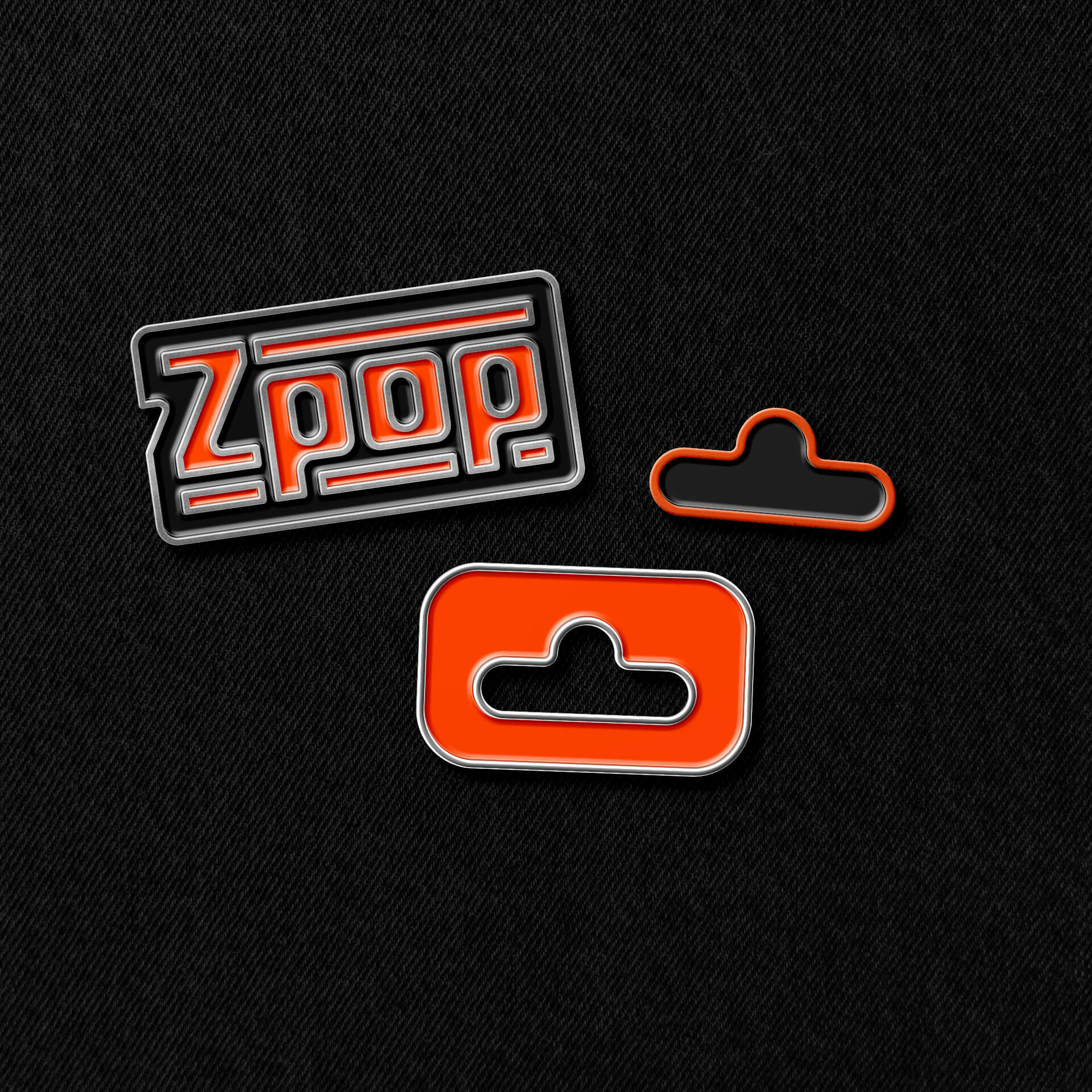
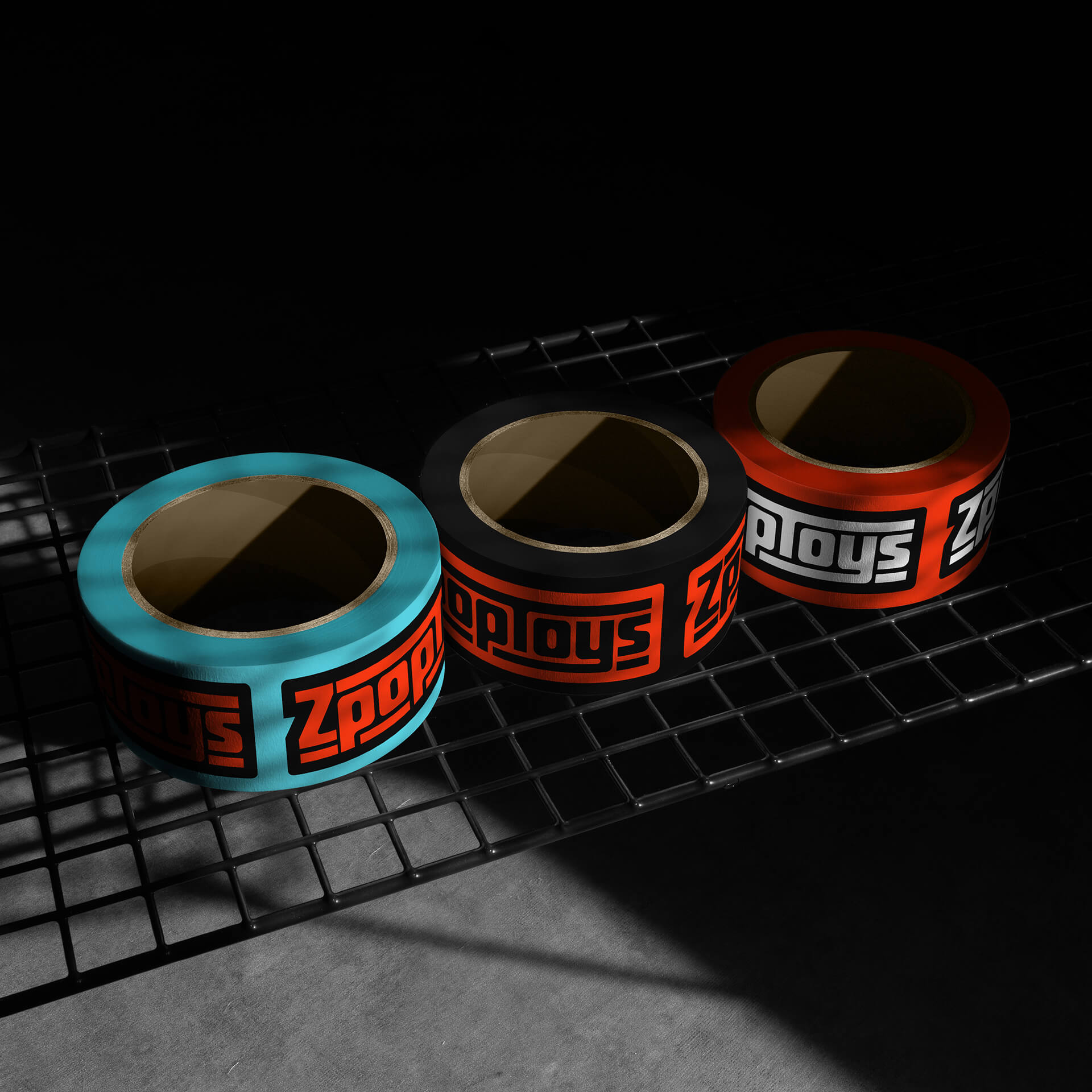
The vision for ZpopToys' wordmark was to craft a logo that would seamlessly fit into the realm of 1970s and 1980s movie franchises, television shows, or comic book titles.
The wordmark impeccably captures the brand's intended nostalgic appeal. Employing glyph ligatures as a unifying element, the logo harkens back to the classic, boxy logos of those years.
-
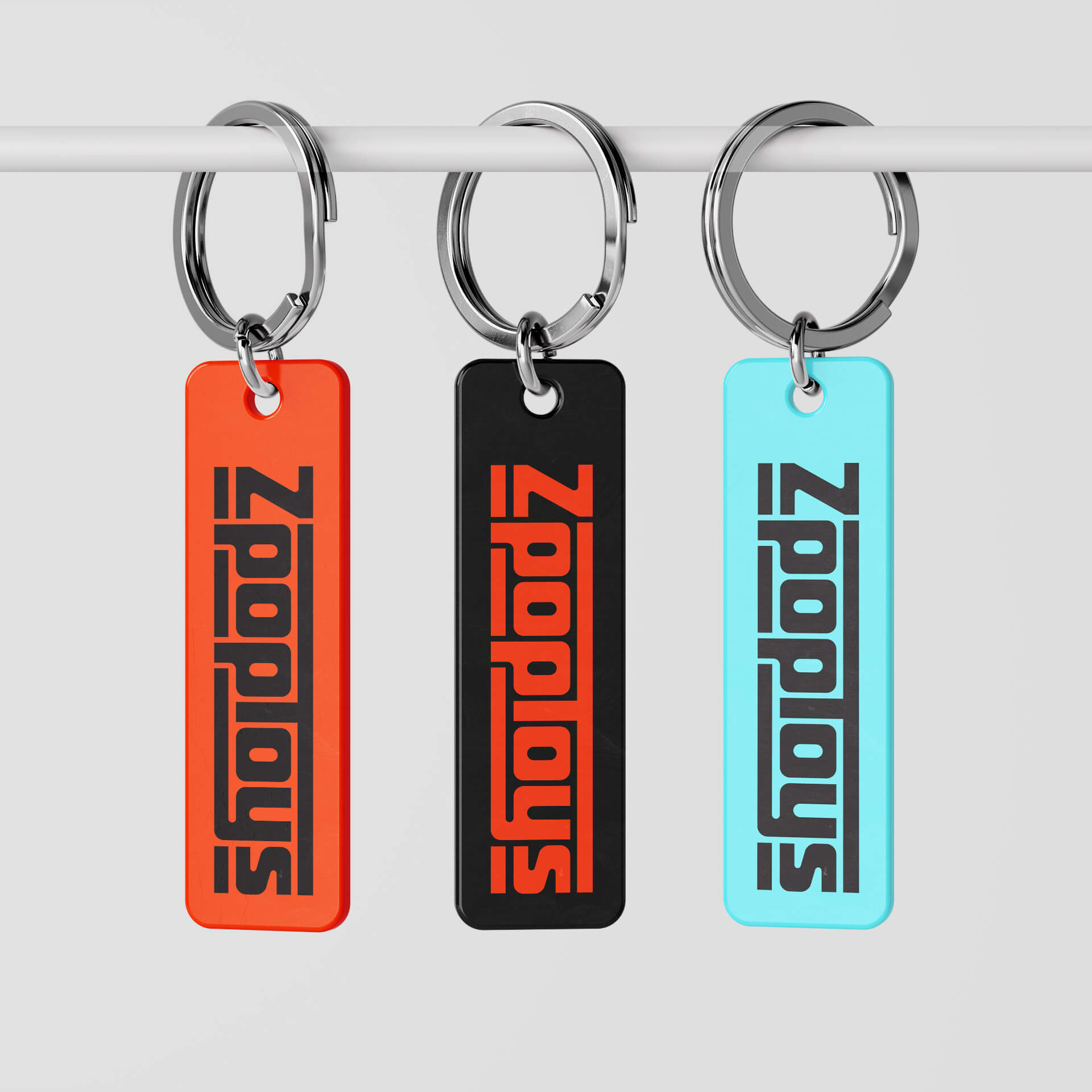
Embracing the spirit of collecting, ZpopToys' symbol features a design element deeply familiar to collectors: the iconic punched hunger hole commonly seen on action figure blisters.
-
![ZpopToys]()
-
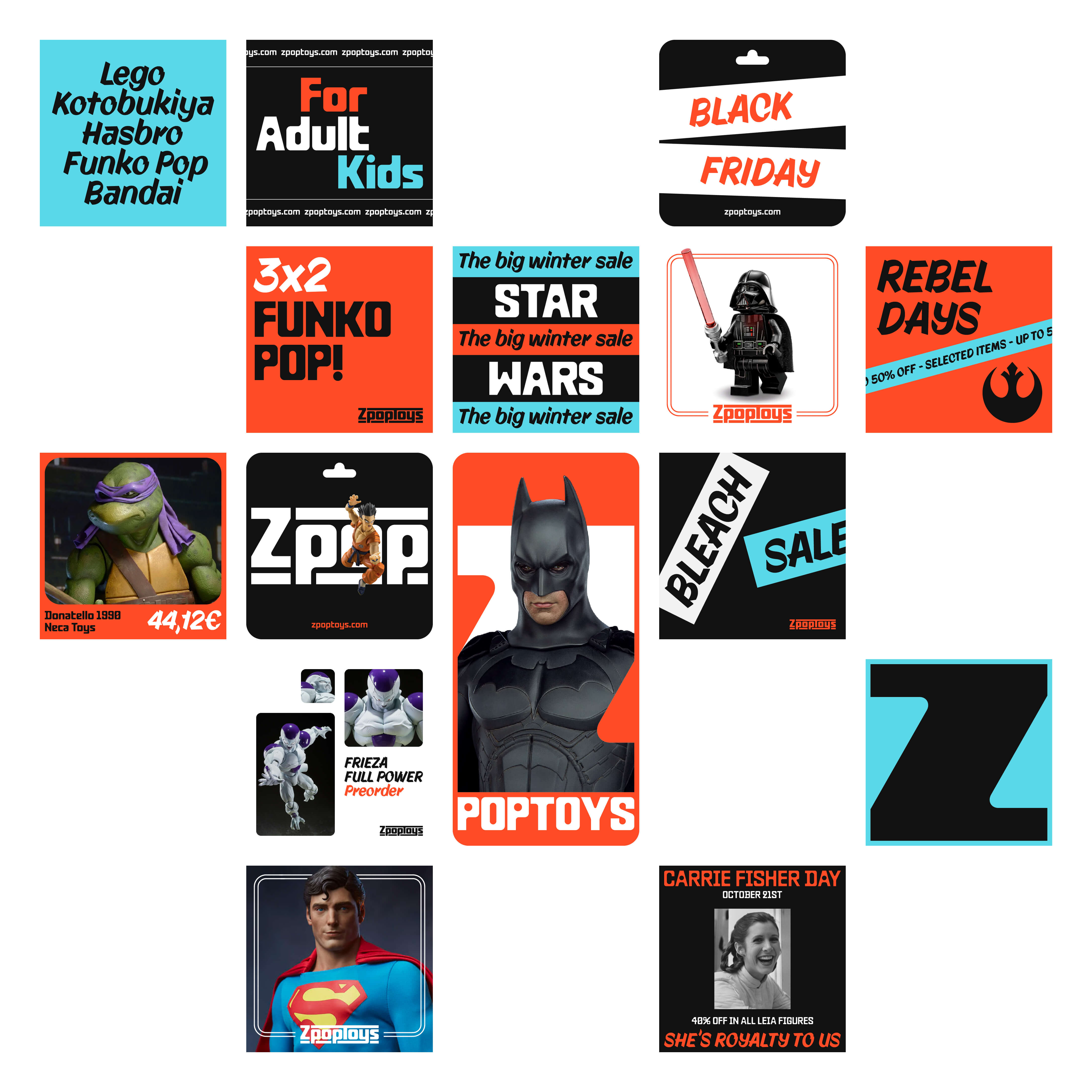
ZpopToys' brand comes alive through highly energetic and visually engaging art direction. Their diverse compositions ensure their social media content remains consistently appealing, dynamic, and full of life.
Branding executions flexes between bold typography for attention-grabbing promotions and product-focused layouts for showcases, ensuring effective communication of both excitement and product value.
-
![ZpopToys]()
-
![ZpopToys]()
-
![ZpopToys]()
-
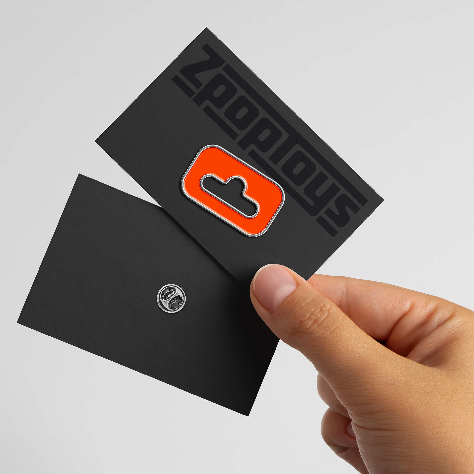
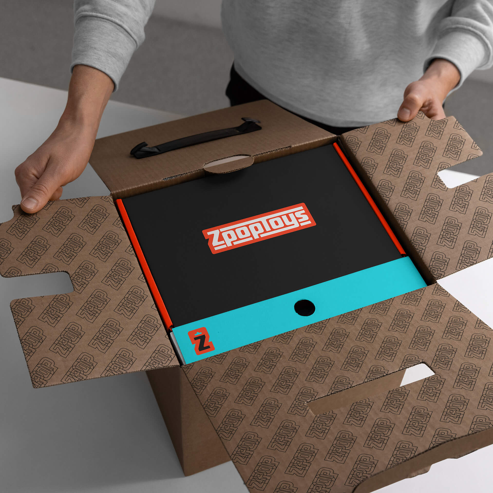
The unifying visual element of ZpopToys' branding is the "punched hole" mark. Serving as the primary identifier and symbol of recognition for ZpopToys, it is prominently featured on any medium where the brand is present, such as cards, stickers, or pins.
-
ZpopToys utilizes a straightforward color palette with a nostalgic, basic feel. This retro inspiration is balanced with a modern twist through bold design choices, creating a fresh and contemporary aesthetic and making ZpopToys a visually dynamic presence that stands out from competitors.
-
![ZpopToys]()
-
![ZpopToys]()
-
-
![ZpopToys]()
-
![ZpopToys]()
-
![ZpopToys]()
All Projects ↓
