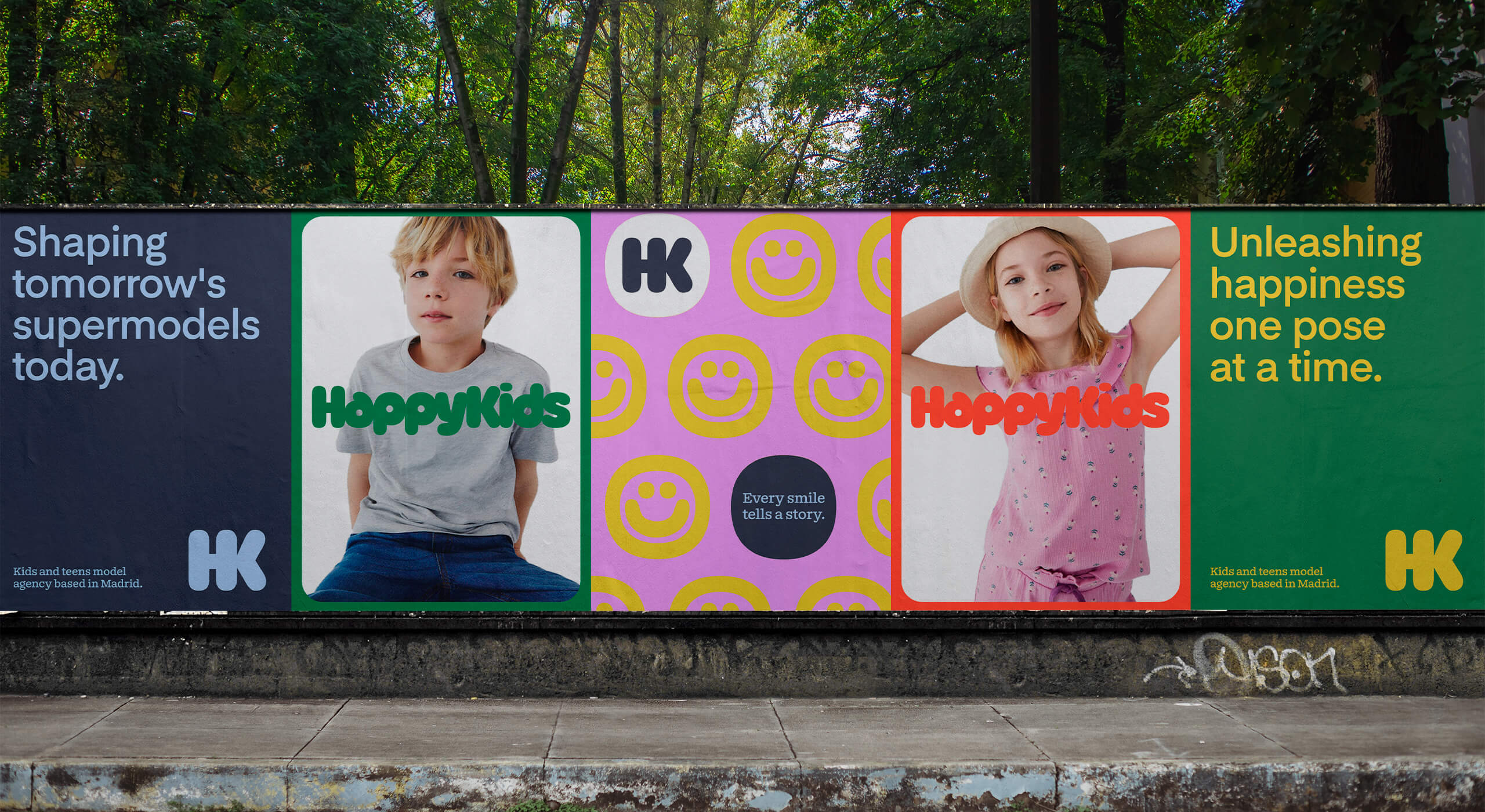
An international modeling agency based in Madrid. Representing boys and girls from all over Europe, they provide talent for a wide range of media and promotional activities such as fashion campaigns, editorials, catalogues, e-commerce, and advertising.
- Brand
- 2024
-
![HappyKids]()
-
![HappyKids]()
-
![HappyKids]()
-
![HappyKids]()
-
Diversity is one of the core values of Happy Kids as a business, and the art direction mirrors this principle through the creation of joyful compositions that are executed in a fun and committed way.
-
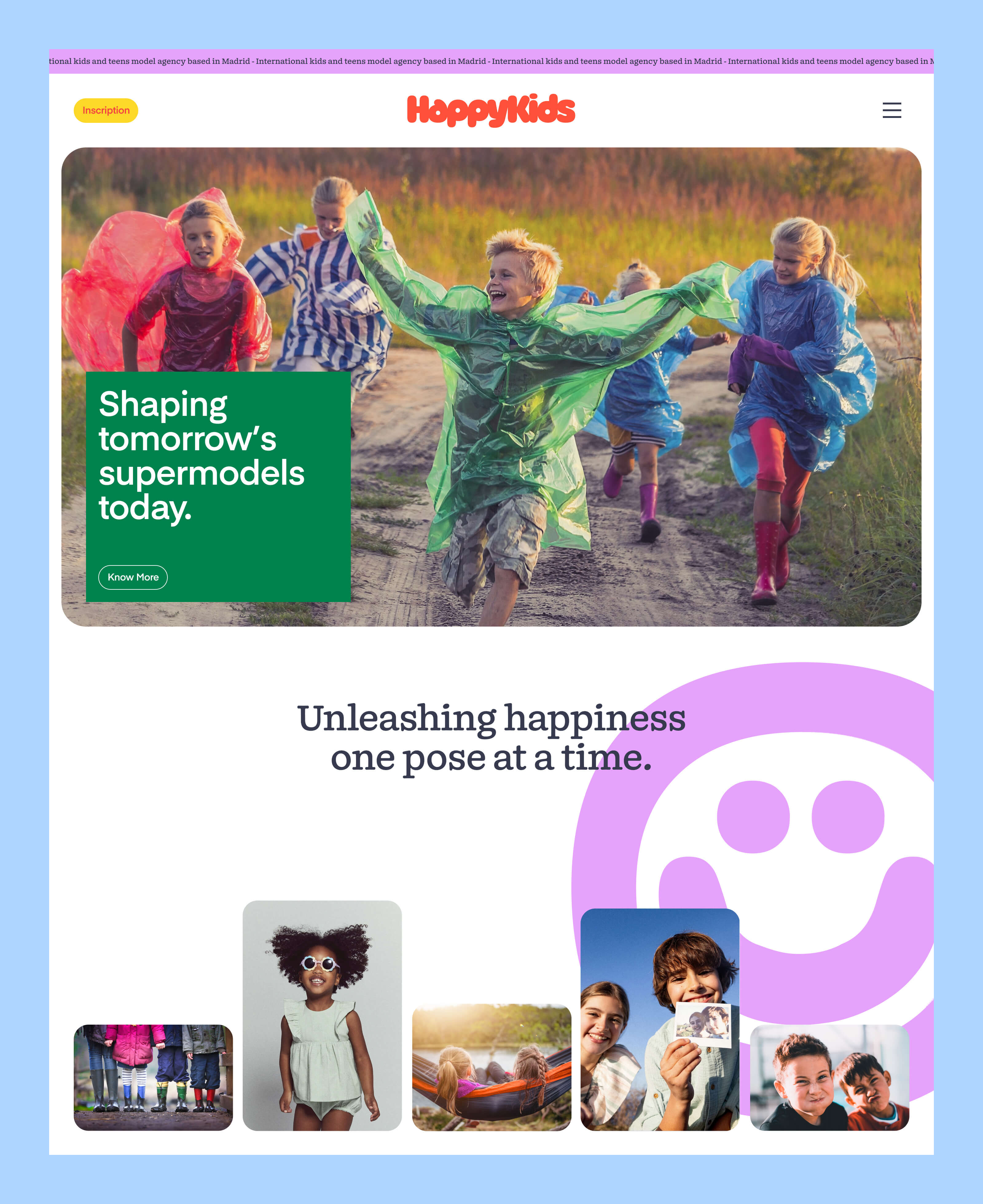
In contrast to the stylized and editorial look of model's photographs, HappyKids' branding is supported by compositions with a youthful, fresh, and slightly naive tone.
-
![HappyKids]()
-
![HappyKids]()
-
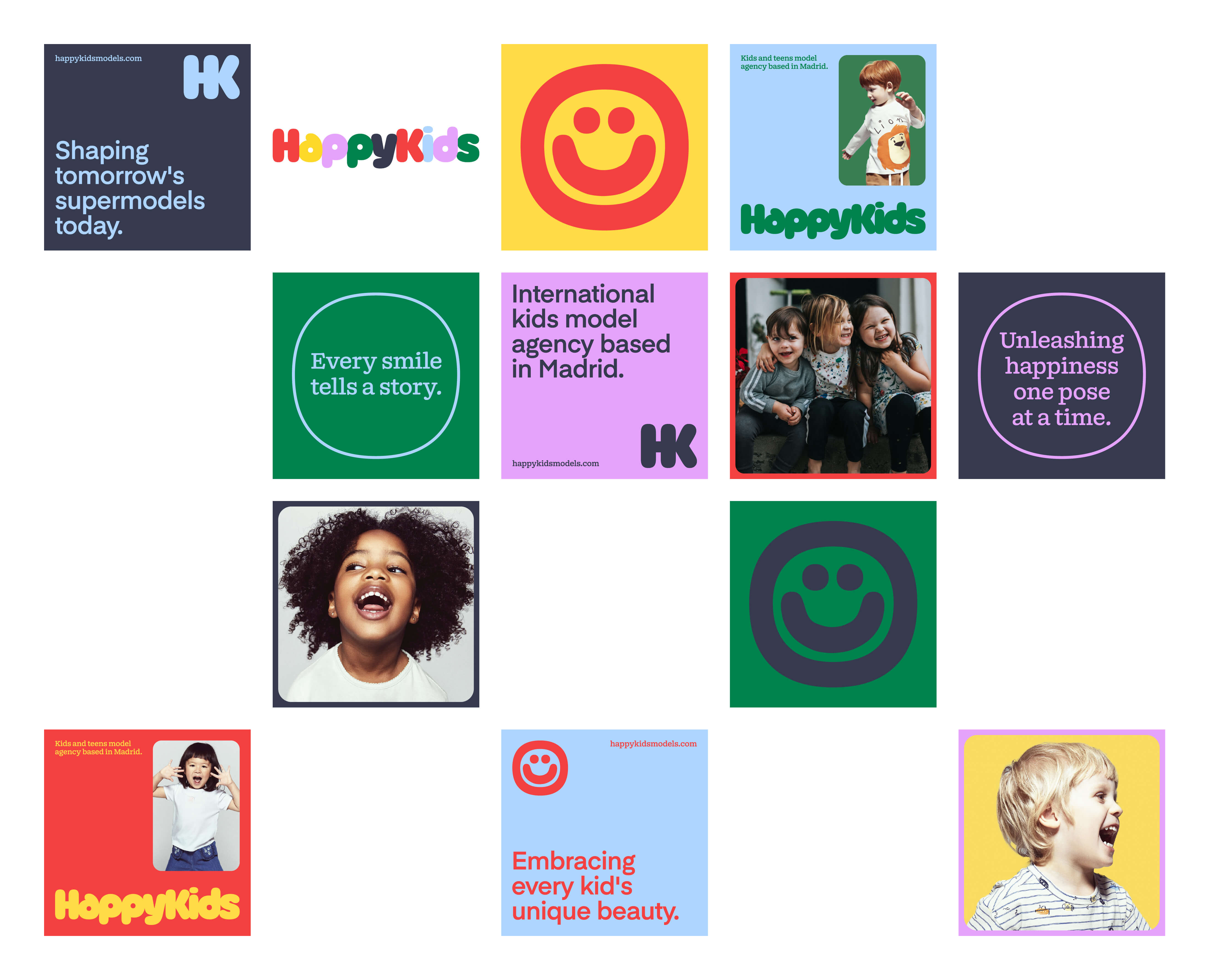
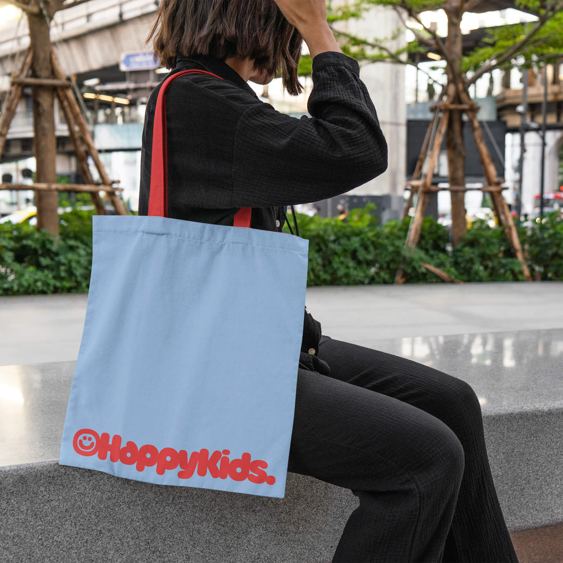
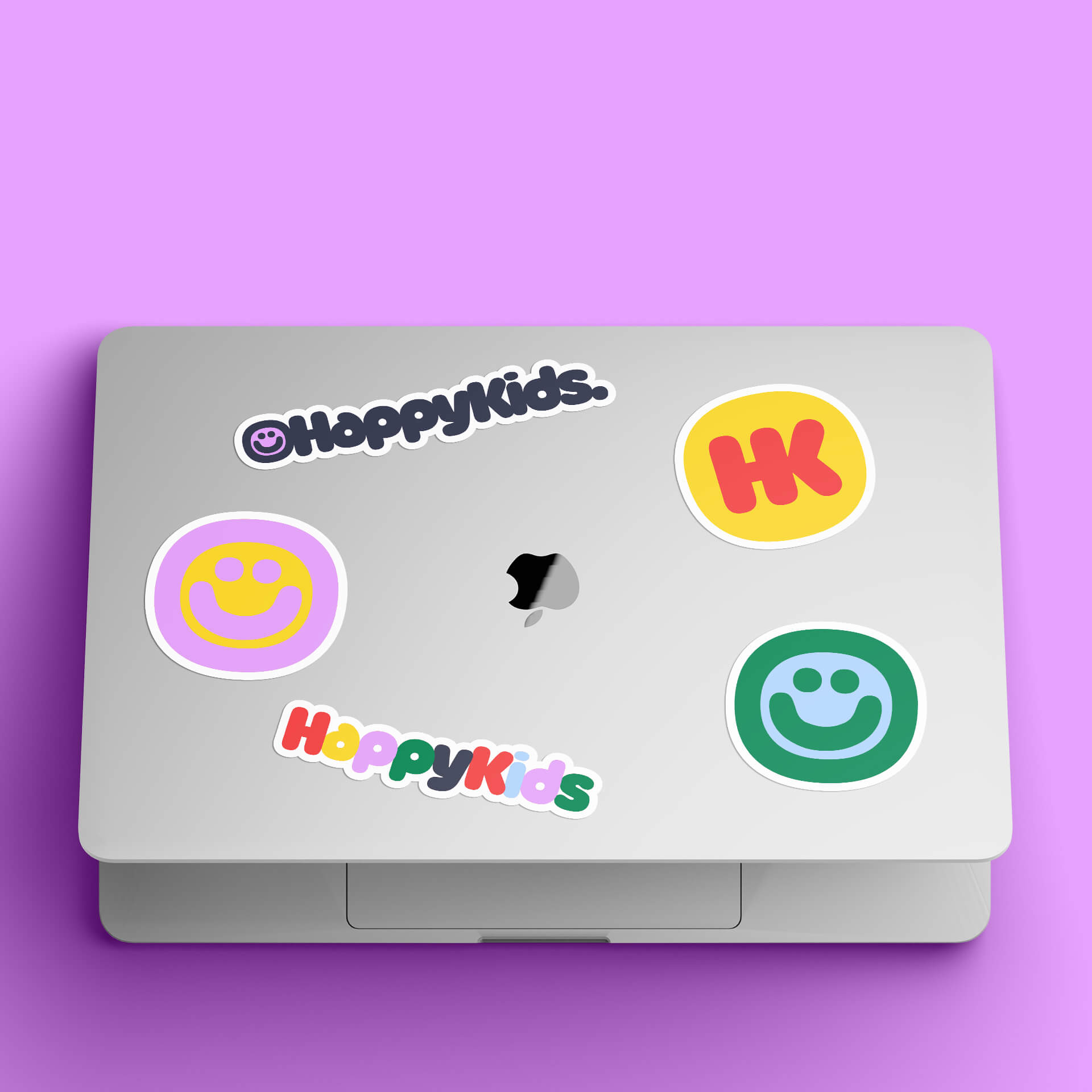
With a palette inspired by classic kindergarten colours, Happy Kids' wordmark steals the spotlight with its catchy, fluffy, and likeable look.
-
By combining the brand's initials into a glyph with the same typographic style, a distinct monogram logo enhances branding applications.
-
![HappyKids]()
-
![HappyKids]()
-
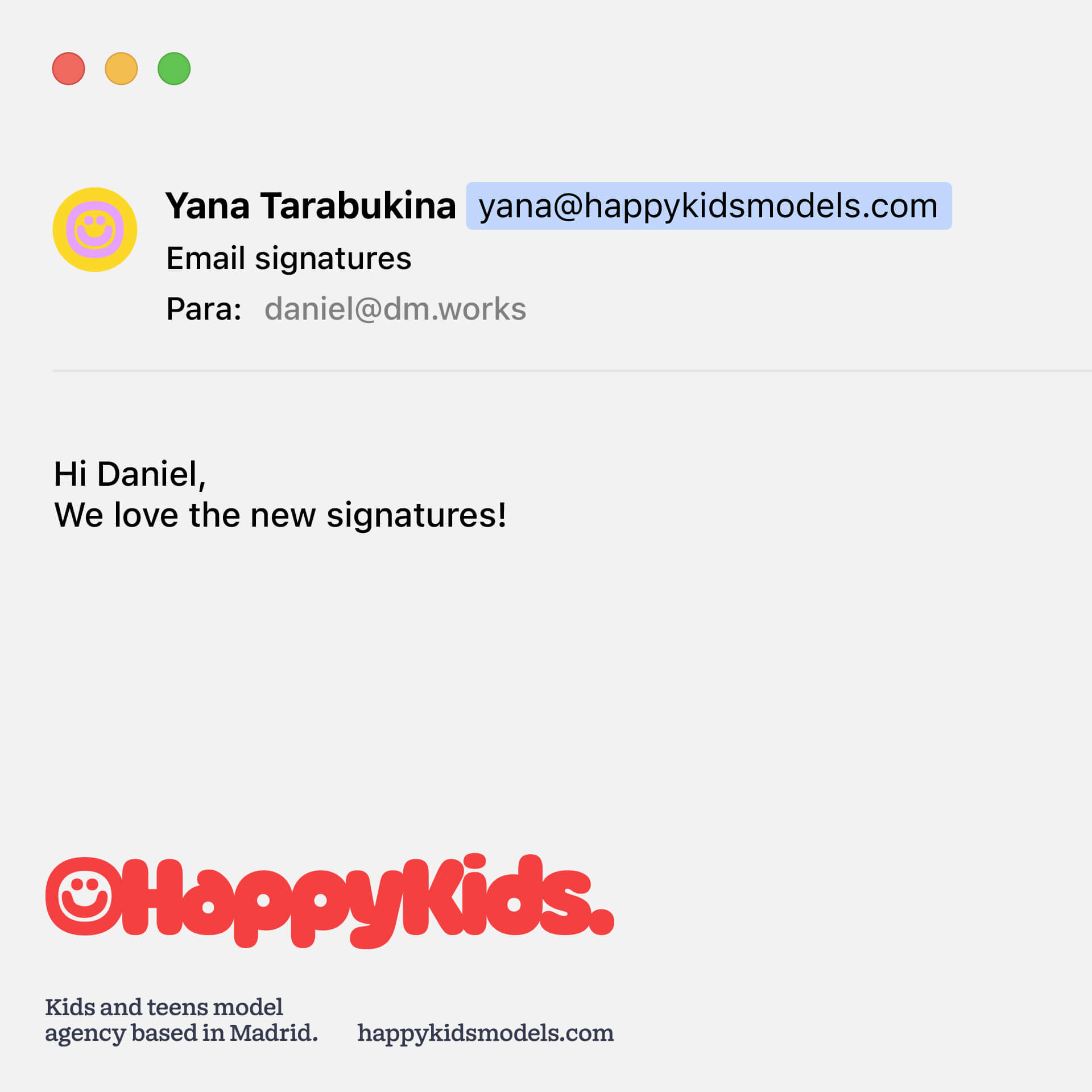
Happy Kids' communication features an array of classic and simple design layouts. Driven by the colour palette, these designs perfectly align with the brand's tone and effectively reinforce its messages and its commitment to creating a positive impact on the lives of the kids it represents.
-
![HappyKids]()
-
![HappyKids]()
-
![HappyKids]()
-
![HappyKids]()
-
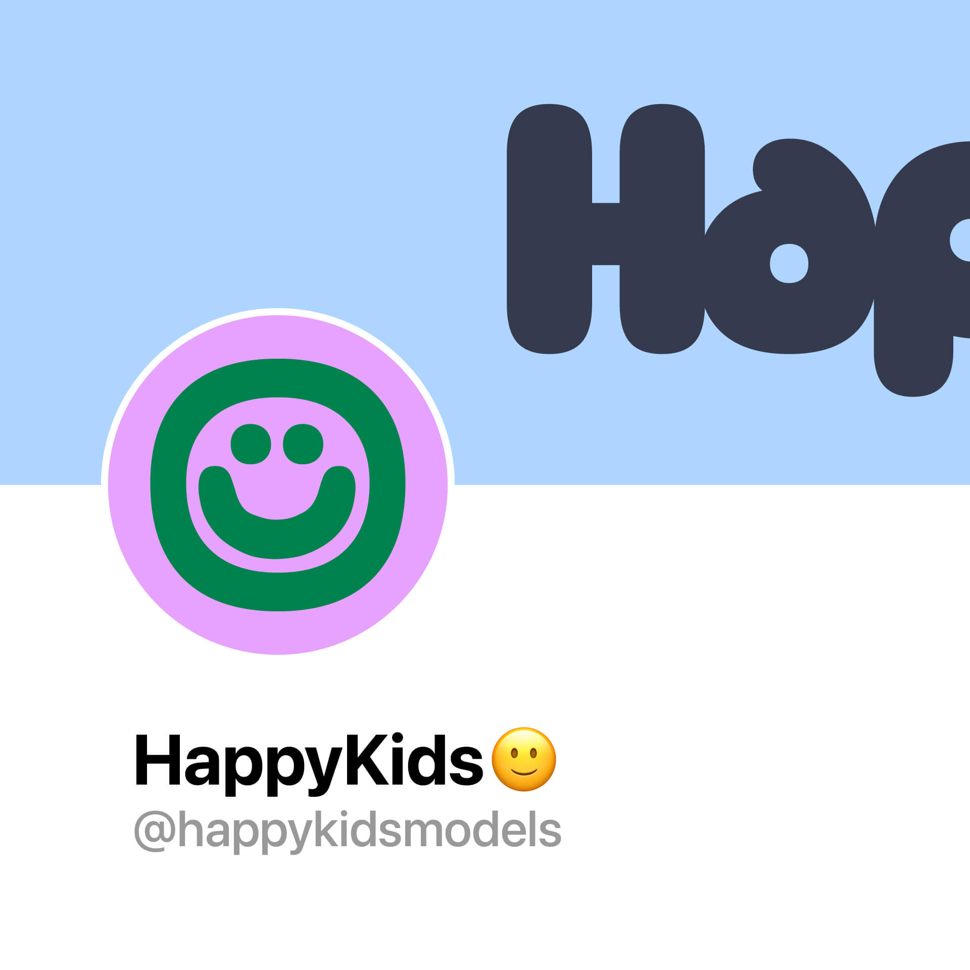
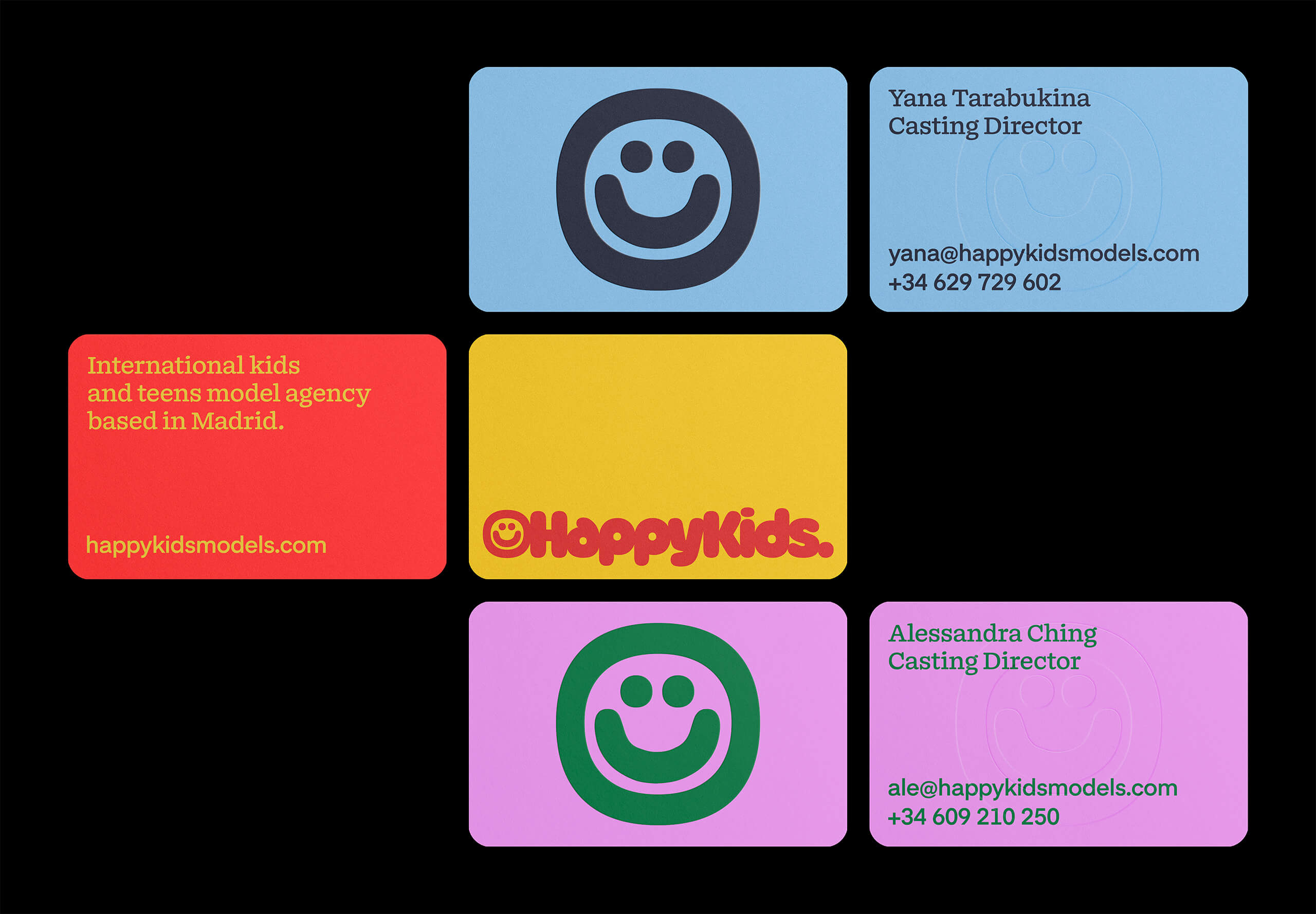
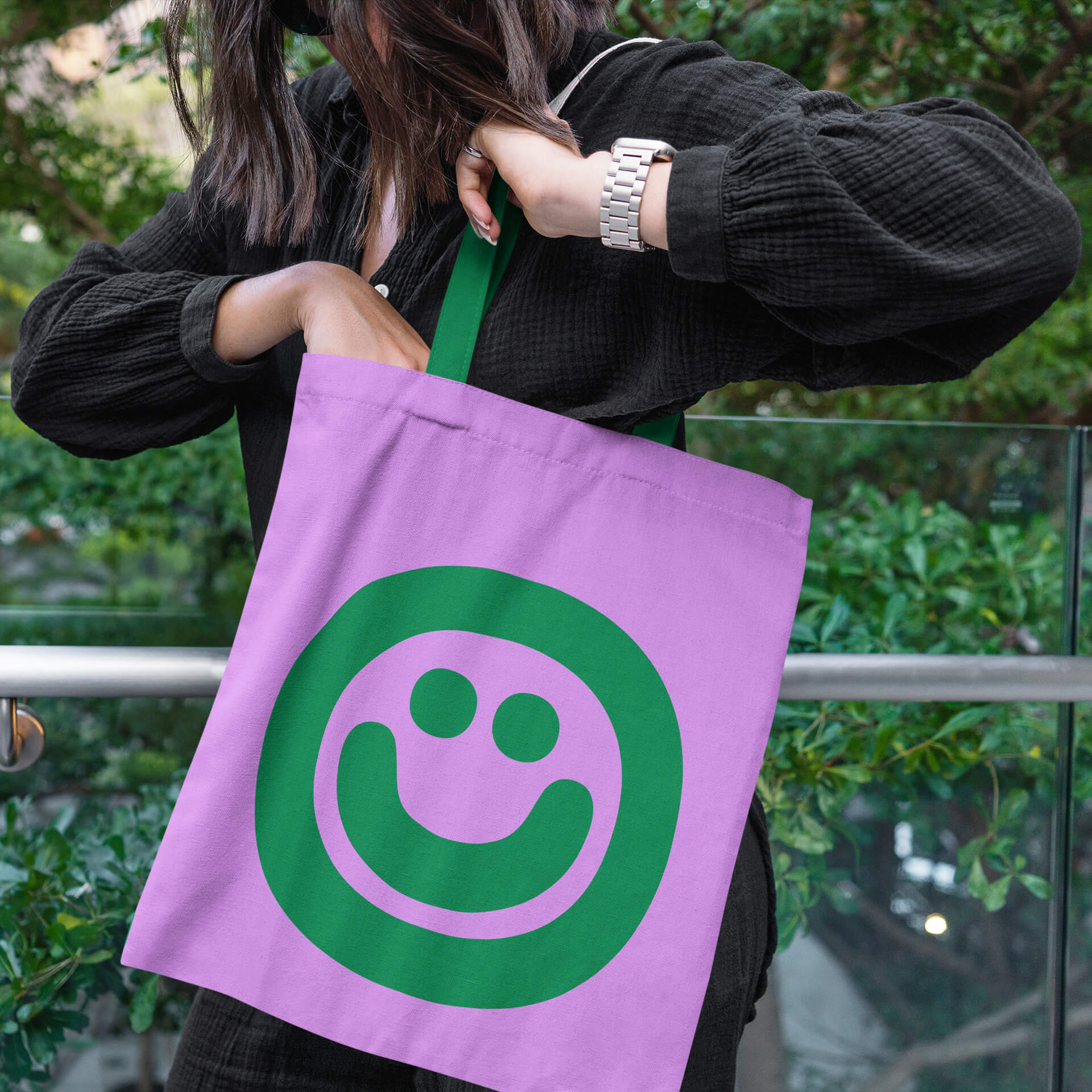
The smiley symbol serves as the primary element for brand identification. Reflecting diversity, this symbol is consistently portrayed in various colour combinations across different platforms.
-
This dynamic use of colours not only reinforces the brand's inclusive and vibrant identity but also ensures a fresh and engaging visual experience for the audience.
-
![HappyKids]()
-
![HappyKids]()
-
![HappyKids]()
-
![HappyKids]()
-
![HappyKids]()
All Projects ↓
