Blinder revolutionizes the dating app ecosystem by focusing in the real people behind the profile pictures. Their approach disrupts the traditional model by encouraging honest curiosity and natural effort on authentic human connections rather than just superficial and staged images.
- Brand, Product
- 2024
-
![Blinder]()
-
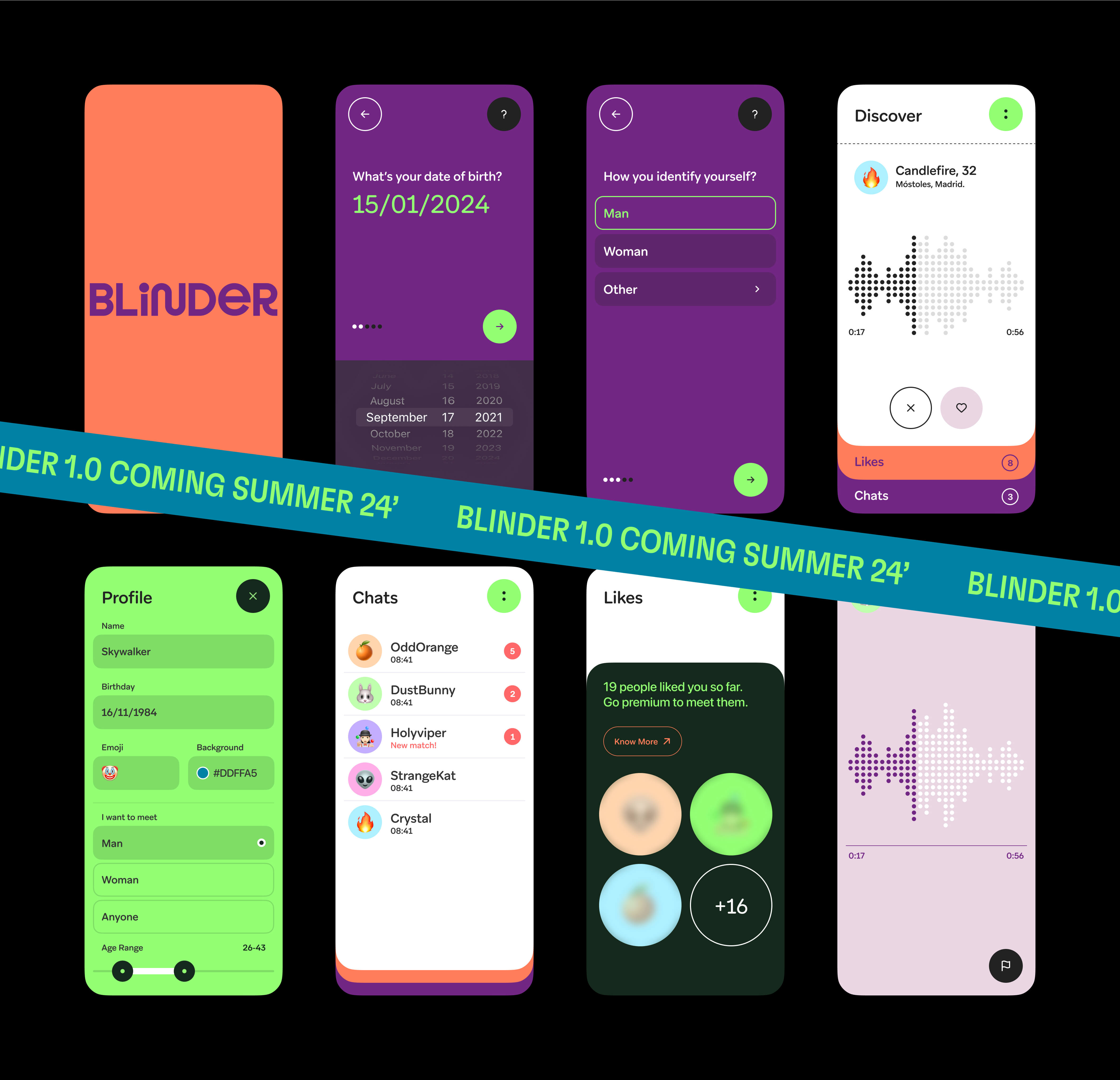
The primary feature of Blinder is the absence of profile pictures since plain audio messages are the only way allowed to match and communicate between users.
-
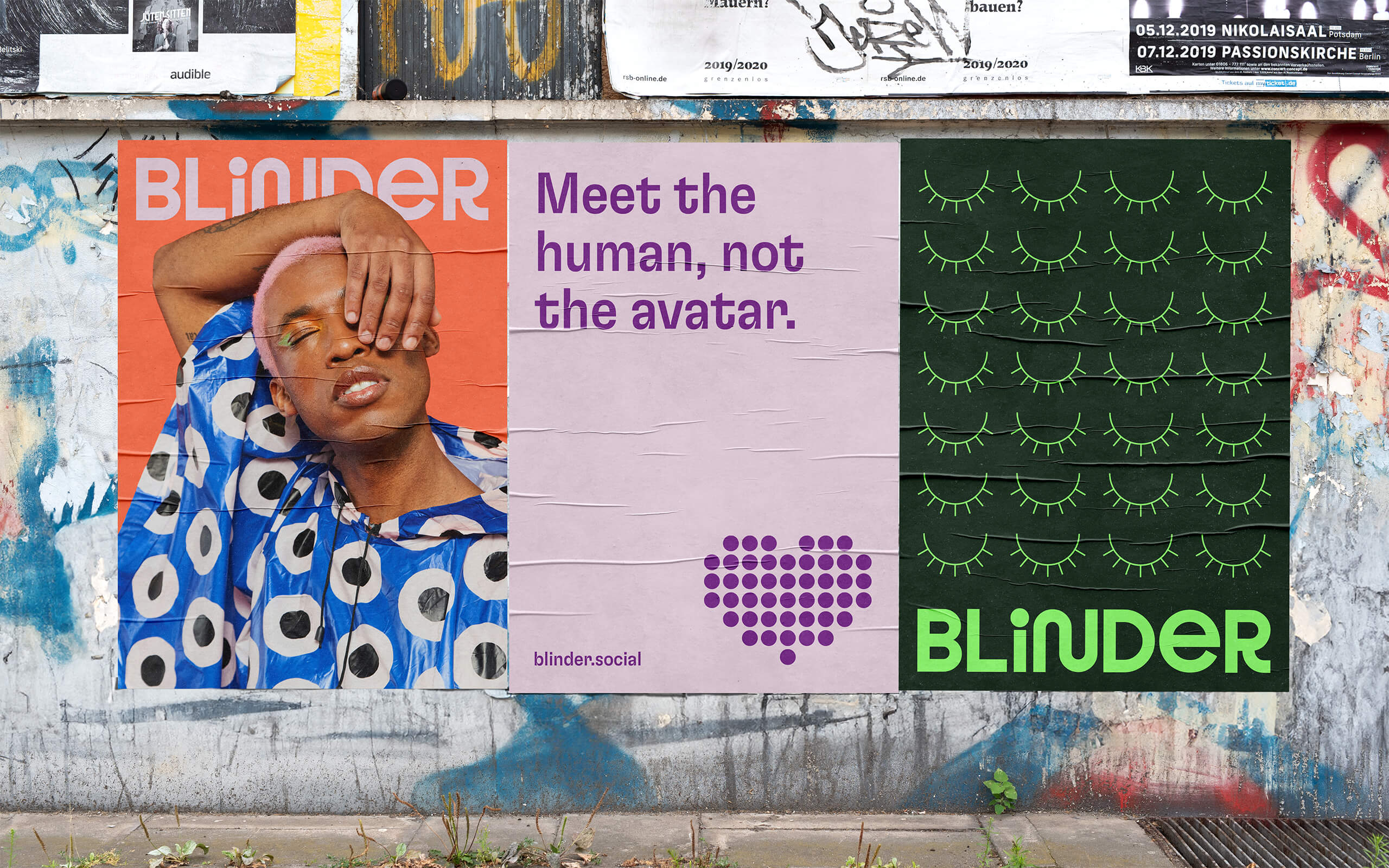
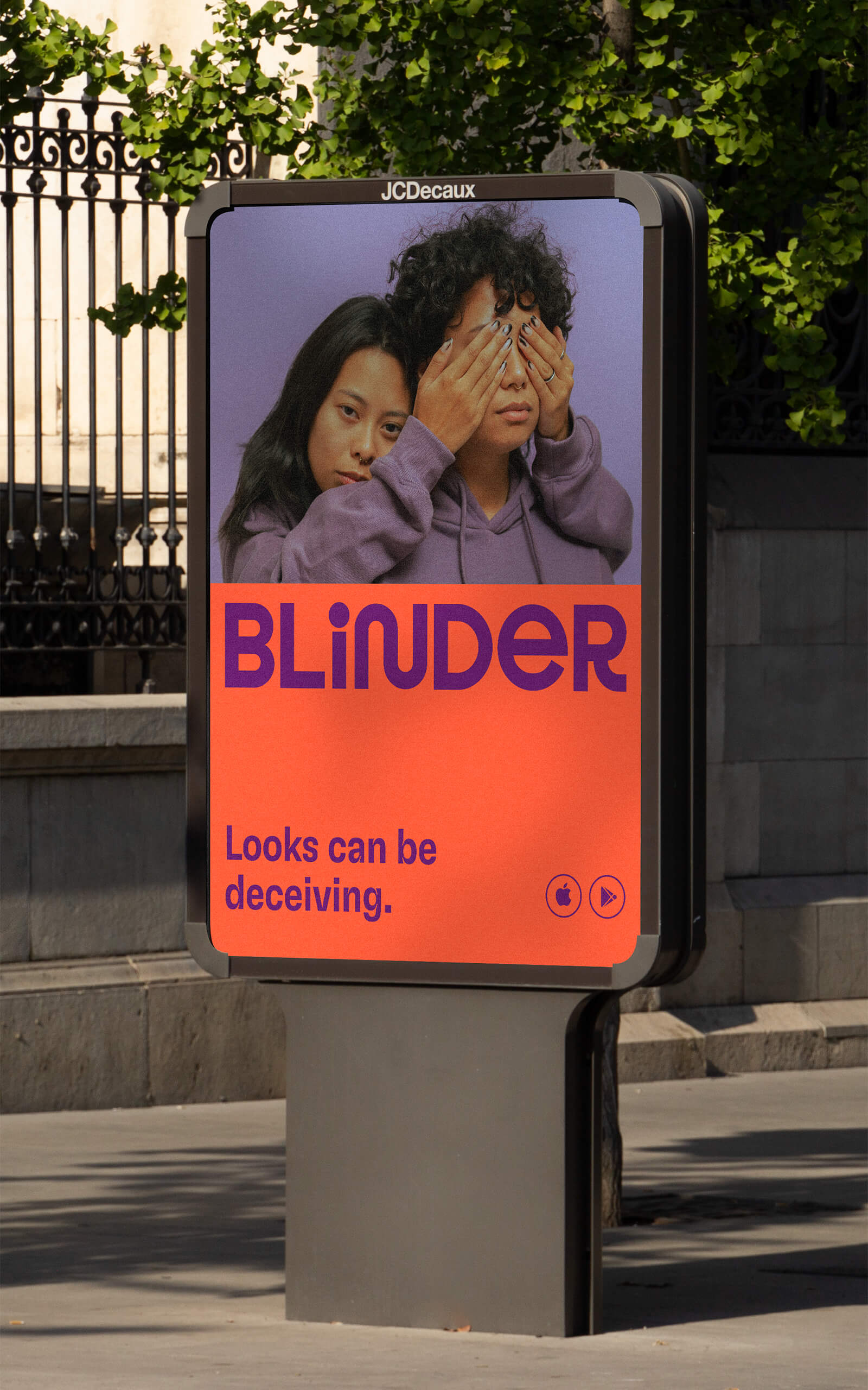
Using an overall fun tone with vibrant colours, this feature is visually translated on the branding, emphasizing the value of knowing real humans without prejudices or stereotypes.
-
![Blinder]()
-
![Blinder]()
-
![Blinder]()
-
Some characters display fun tweaks reinforcing this proposal, as the 'N' being symbolic of the journey users take to find their significant other, or the 'R' lifting up its leg as if it were kissing someone.
Mixing uppercase and lowercase characters in a coherent way, the Blinder wordmark represents visually the diversity and inclusion present in Blinder's dating proposal.
-
![Blinder]()
-
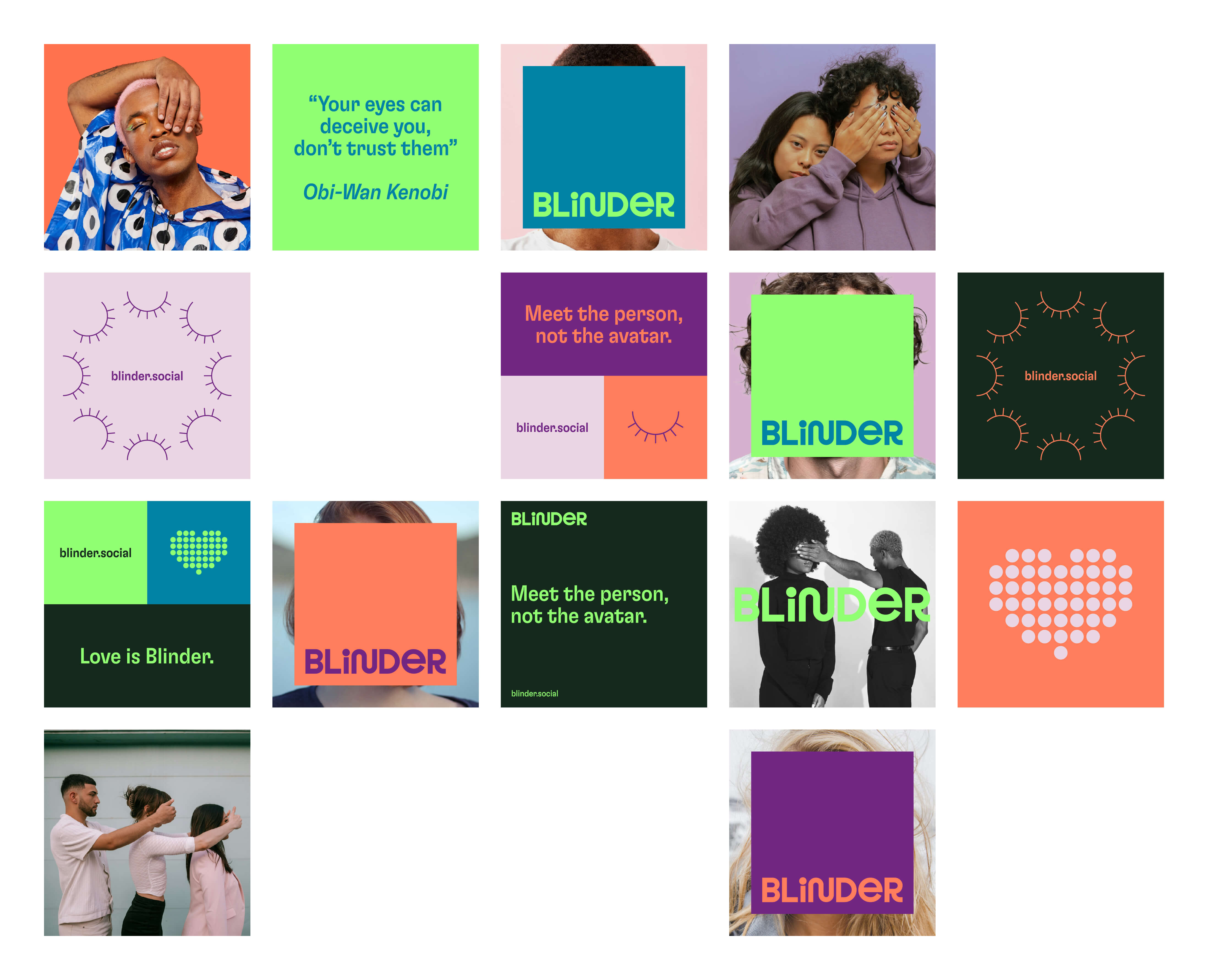
Blinder's art direction utilizes both communication axes to visually express its concept.
Photographs of people with their eyes covered are used from the perspective of the sender of the message, while the receiver's perspective is represented by portraits of people with their faces strategically covered by a Blinder card.
-
![Blinder]()
-
![Blinder]()
-
![Blinder]()
-
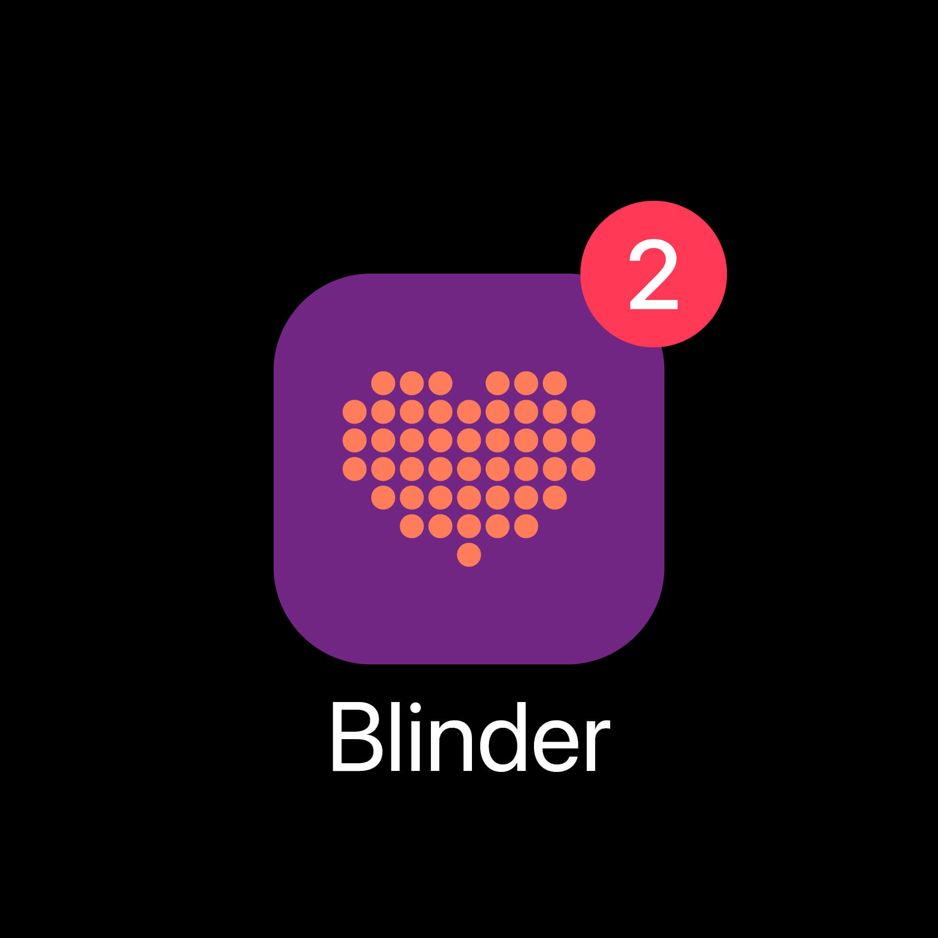
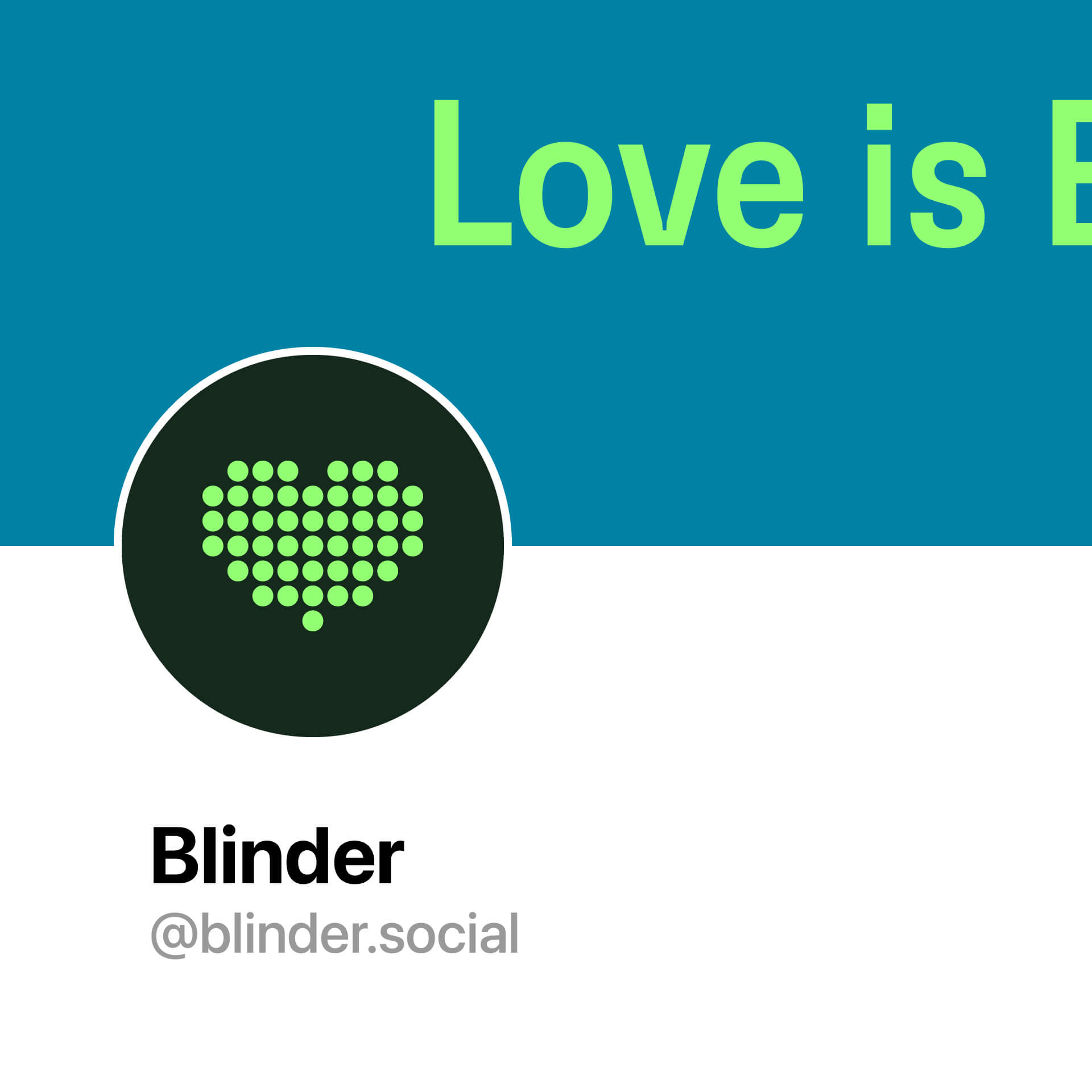
Blinder's heart symbol serves as the representative mark on all platforms, from social profiles to the app icon.
Its dotted texture reproduces and mirrors the in-app animation when an audio message is played.
-
![Blinder]()
-
-
![Blinder]()
-
![Blinder]()
All Projects ↓
