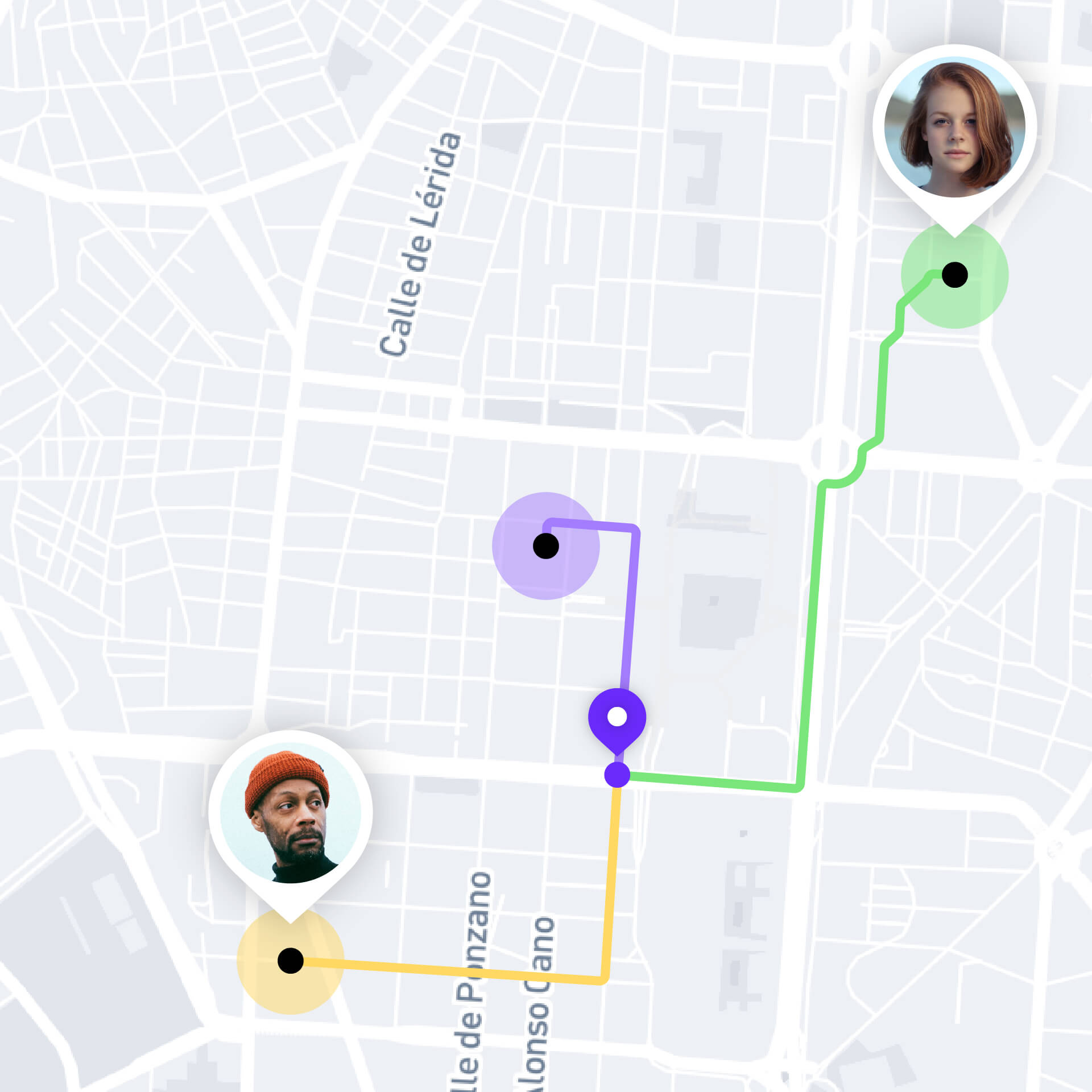
Wola is a geolocation app designed to enhance social experiences by making it easy to connect with friends and people with common interests. With its group features, Wola effortlessly helps to plan and create events and get contacts on board for unforgettable meetings.
- Brand, Product
- 2018
-
![Wola]()
-
Wola is a geolocation app similar to Wave, but with a focus on the fun and social side of life. While Wave targets families and close friends, Wola connects users with their broader social circle based on shared interests and hobbies.
-
Built upon the foundation of Wave 2.0, Wola introduces a suite of social tools that complement its geolocation features, allowing users to join groups based on shared interests, such as running, music, and more. Several of Wola's innovative features were later incorporated into Wave 3.0.
-
![Wola]()
-
![Wola]()
-
![Wola]()
-
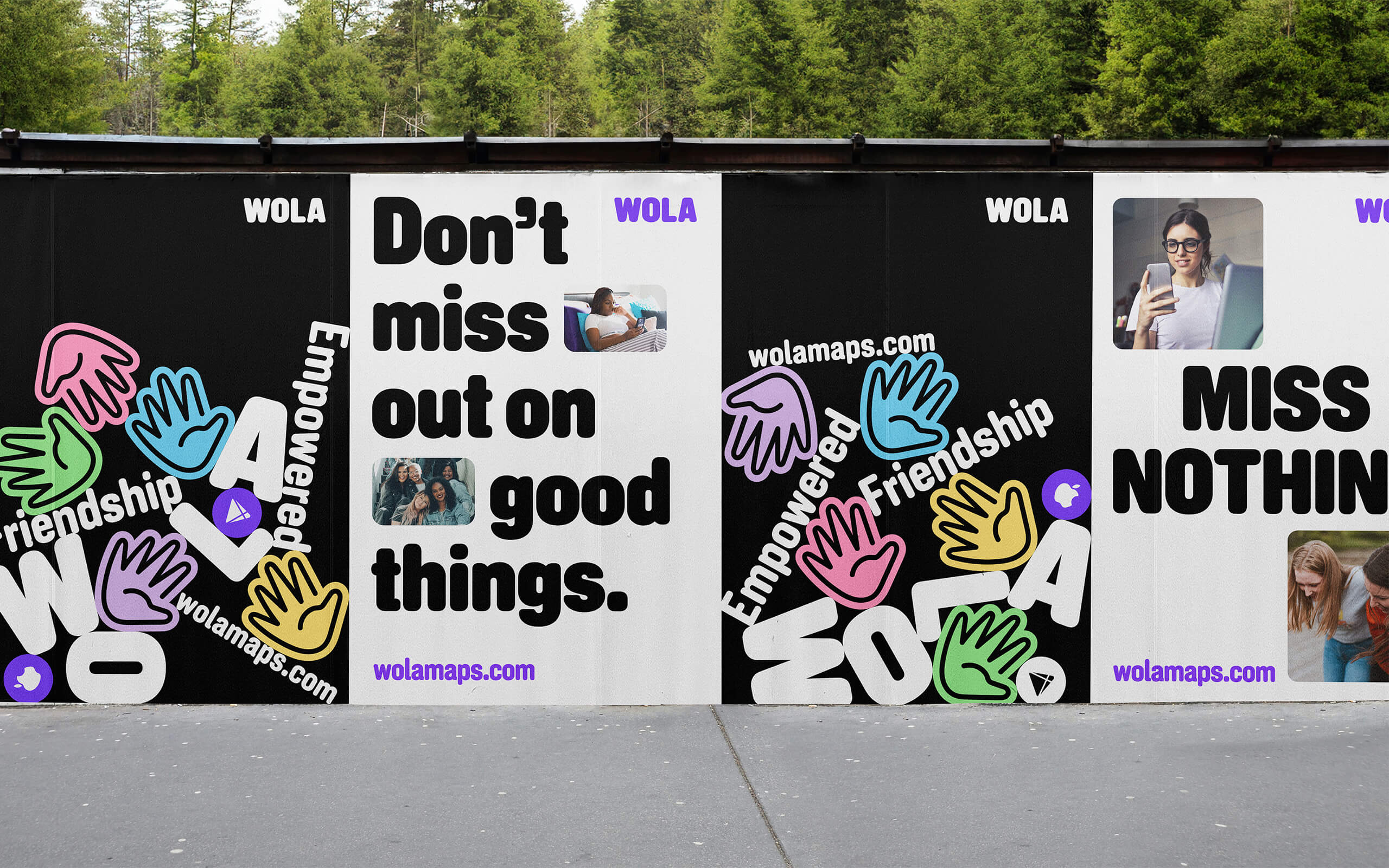
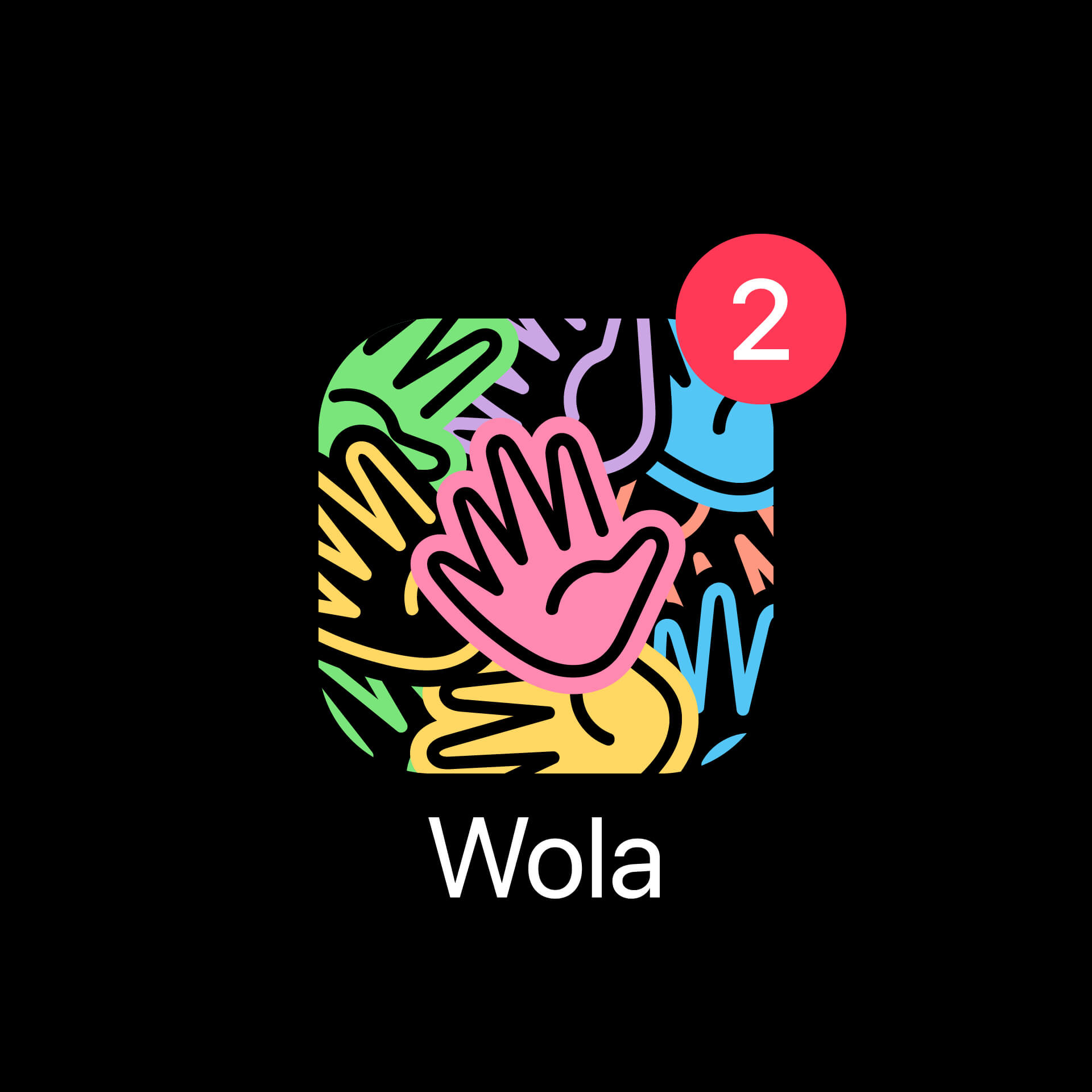
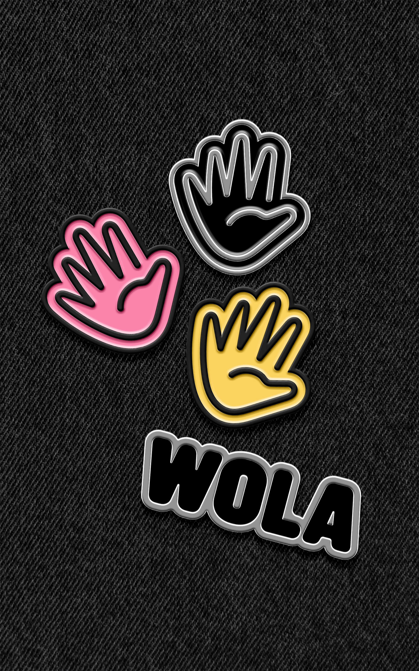
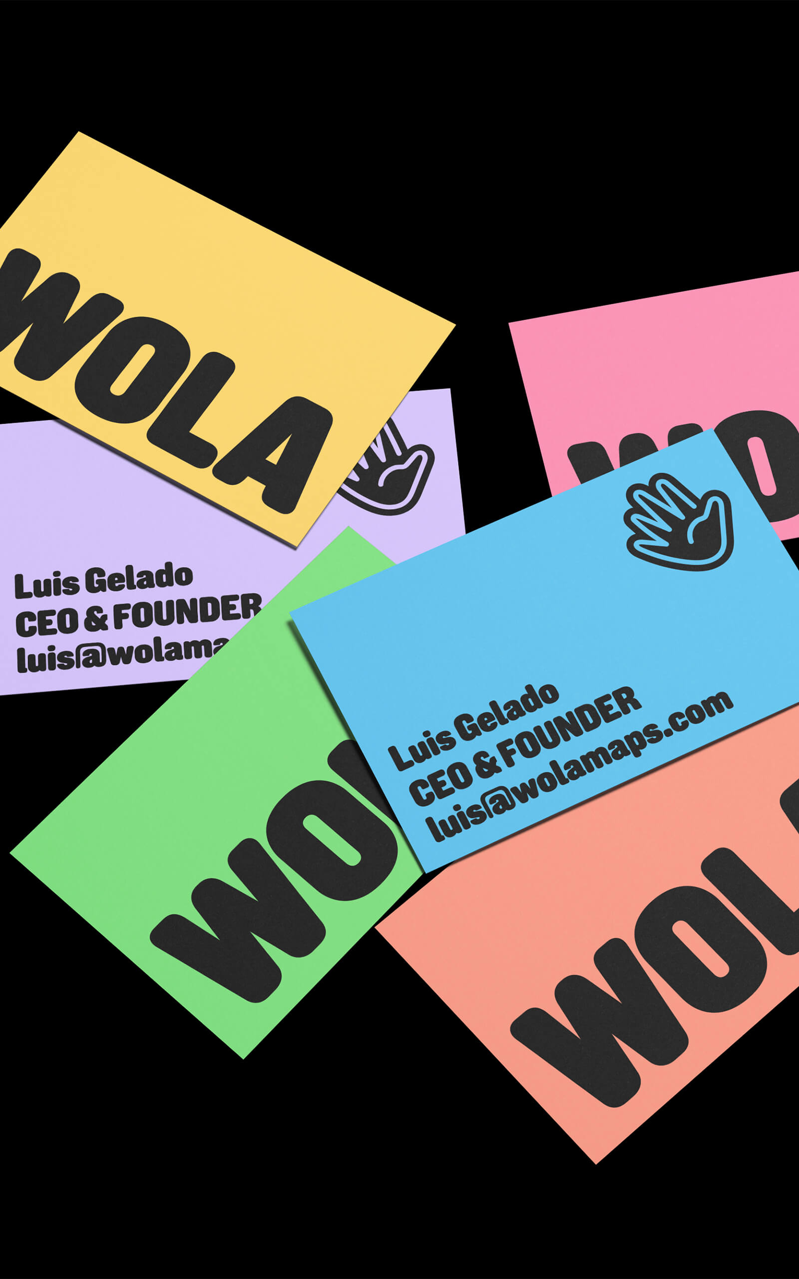
The name Wola is an informal alternative to the Spanish word "Hola," meaning "hello." Its logo, a sticker-like waving hand, further emphasizes its social and festive nature.
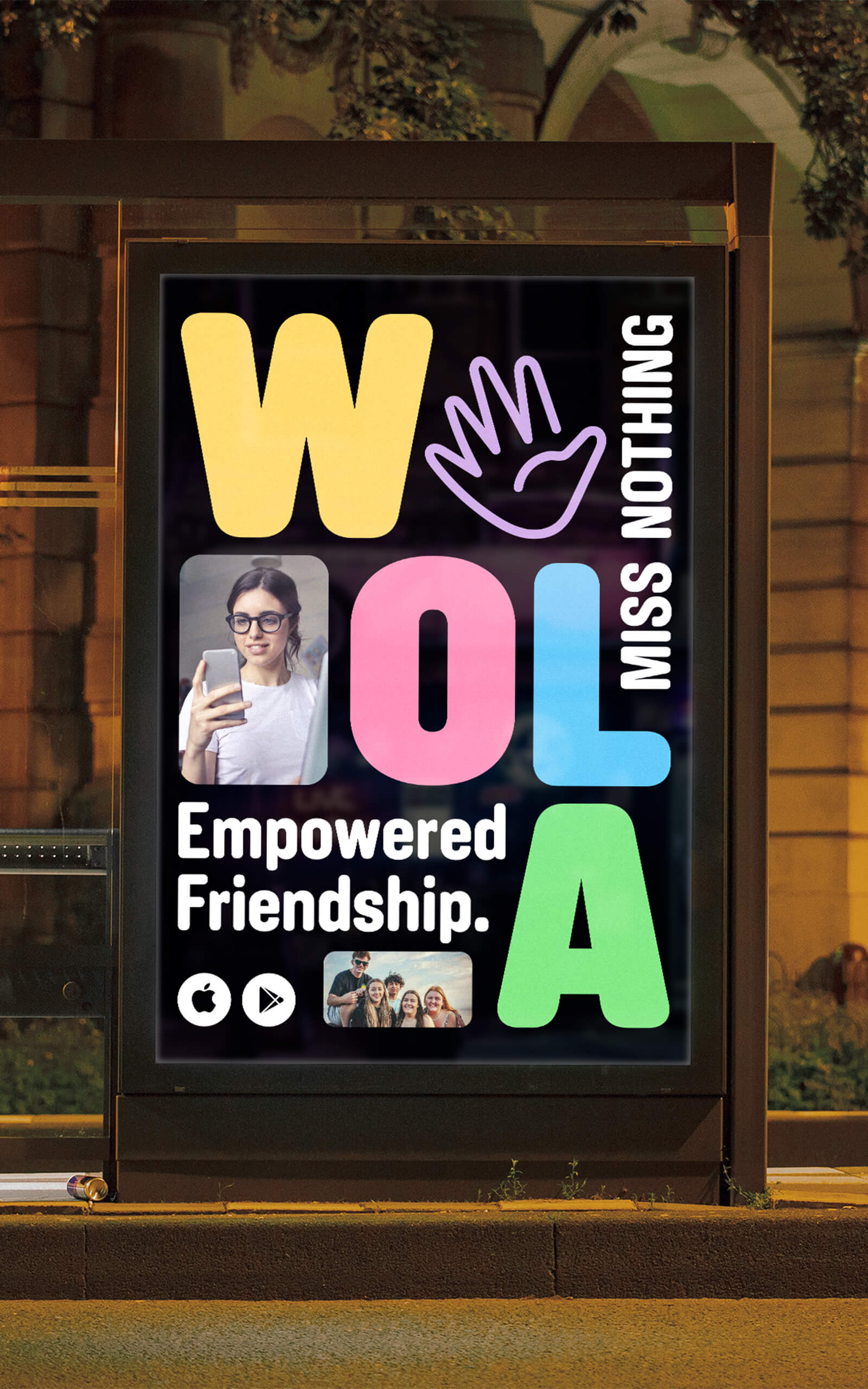
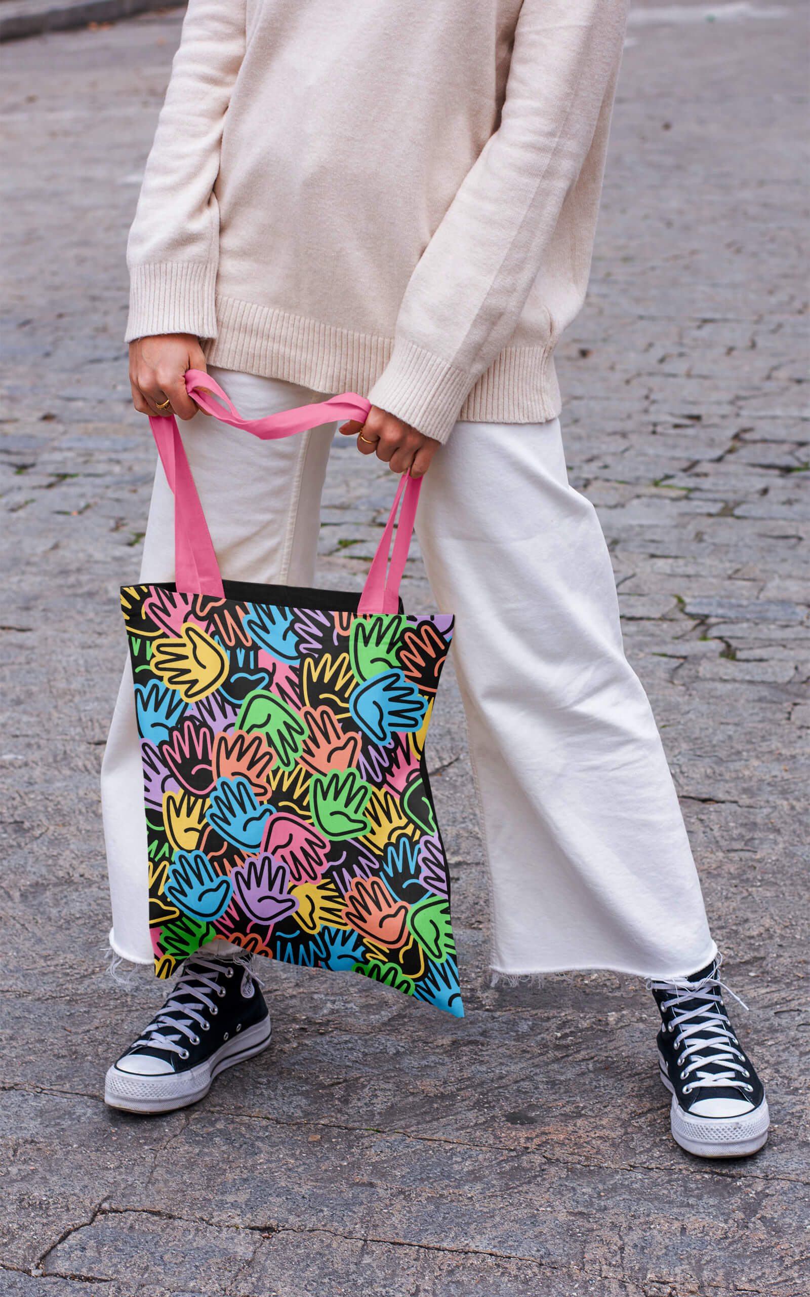
Wola's branding features a lively spectrum of colours, with an emphasis on violet, the app's signature hue. These colours are used almost randomly throughout the branding, creating a sense of dynamism and energy.
-
![Wola]()
-
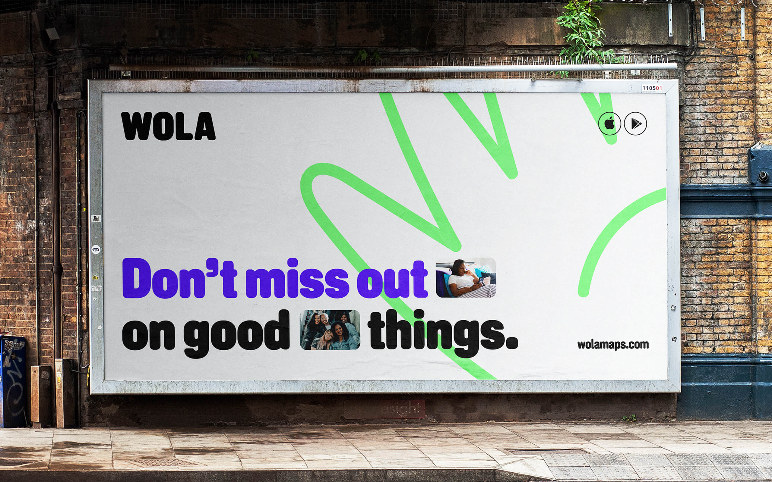
Wola's art direction exudes a youthful vibe. The bold, slightly narrow, and rounded typeface serves as the brand's unifying element, enabling playful executions with straightforward messages accompanied by images showcasing the app's use cases.
The horizontal hierarchy among the colors ensures that no single color dominates, resulting in a visually balanced and harmonious overall effect.
-
![Wola]()
-
![Wola]()
-
![Wola]()
-
![Wola]()
-
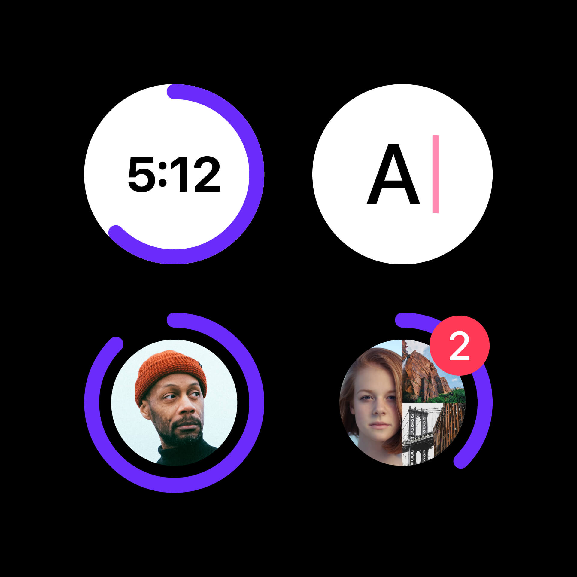
Wola's user experience is designed to be exceptionally user-friendly and accessible. Ensuring a minimal learning curve, the design process places the user at the heart of all decisions, emphasizing ease of use and functionality.
Wola's UI is clear and simple. The use of icons and rounded buttons complements perfectly the art direction, not only enhancing the visual appeal, but also contributing to a sense of comfort for the user.
-
![Wola]()
-
![Wola]()
-
![Wola]()
-
![Wola]()
-
![Wola]()
-
![Wola]()
-
![Wola]()
All Projects ↓
