Trazer is a carpooling app that connects passengers with nearby drivers who share similar routes. Offering a convenient and efficient way to travel, users reduce the stress associated with traffic and contribute to a positive environmental impact by lowering their carbon footprint.
- Brand
- 2019
-
![Trazer]()
-
In recent years, traffic in cities like Madrid and Barcelona has significantly worsened. This, along with increasing restrictions on vehicle circulation in urban areas, has aggressively impacted the balance between professional and personal life for many.
-
According to official data, more than 75% of those vehicles circulate with a single occupant (just the driver), saturating public roads and contributing ineffectively to urban mobility.
Trazer is a WLT that addresses this issue by reducing the ratio of cars to occupants, thereby promoting a more sustainable, efficient and eco-friendly urban mobility.
-
![Trazer]()
-
![Trazer]()
-
![Trazer]()
-
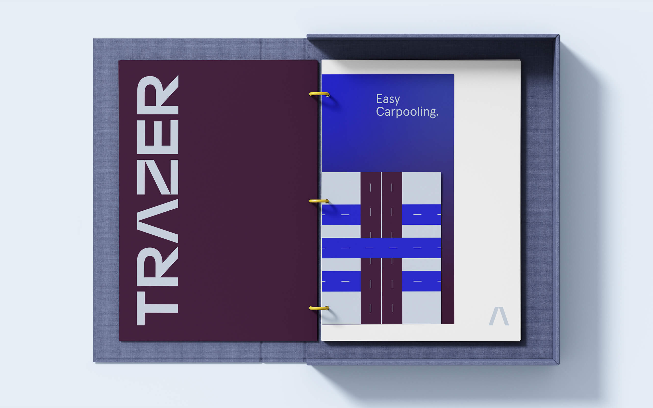
During the initial product concept stages of Trazer, the marketing department suggested that its branding should resemble that of an automobile manufacturer, rather than the cartoonish style prevalent in other well-known similar apps.
Following that concept, they chose the name Trazer because it evokes the name of a car model, like Toyota Trazer or Ford Trazer. The indication I received for designing the logotype was to make it look like a car model name, as if it could be chrome-plated on a car's trunk.
-
![Trazer]()
-
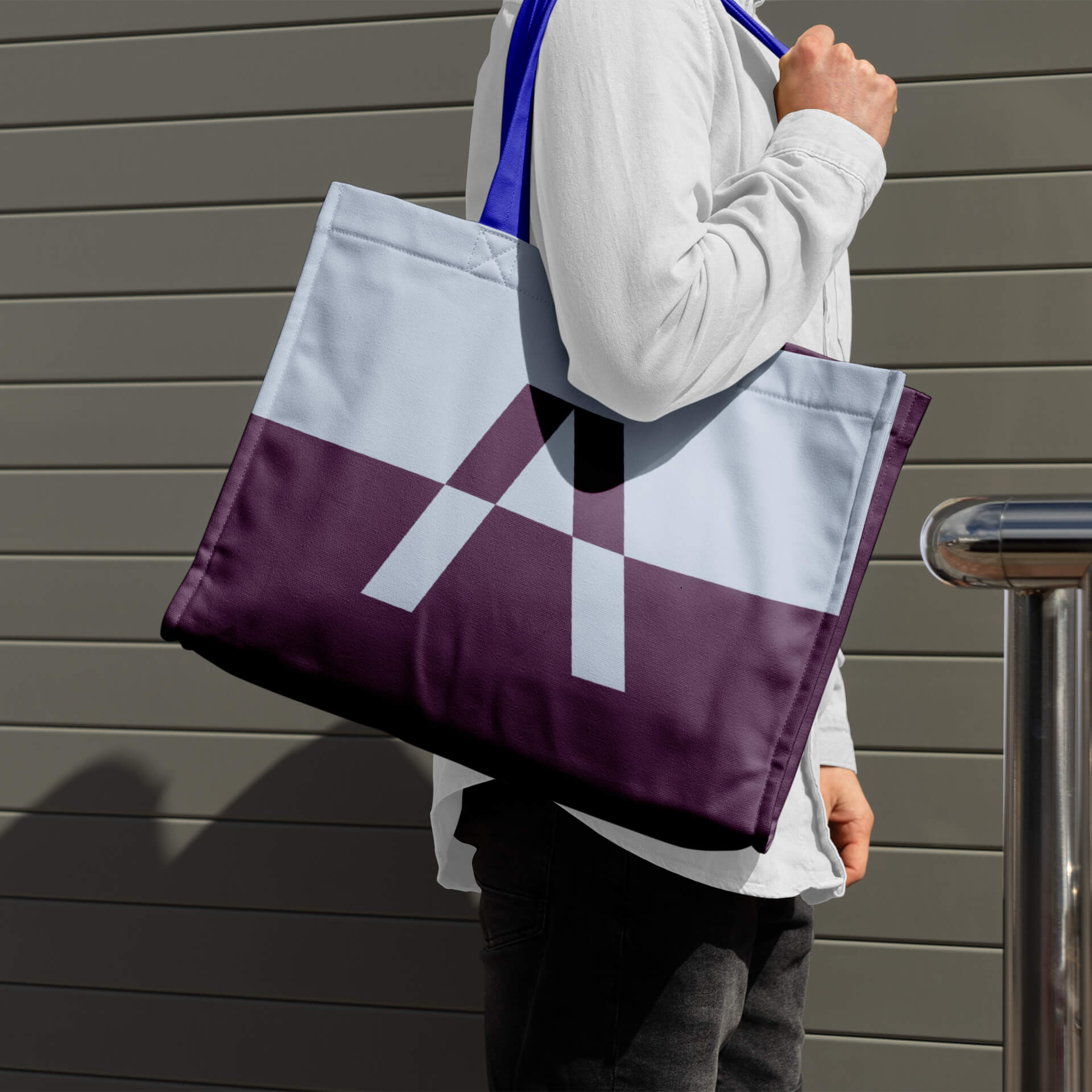
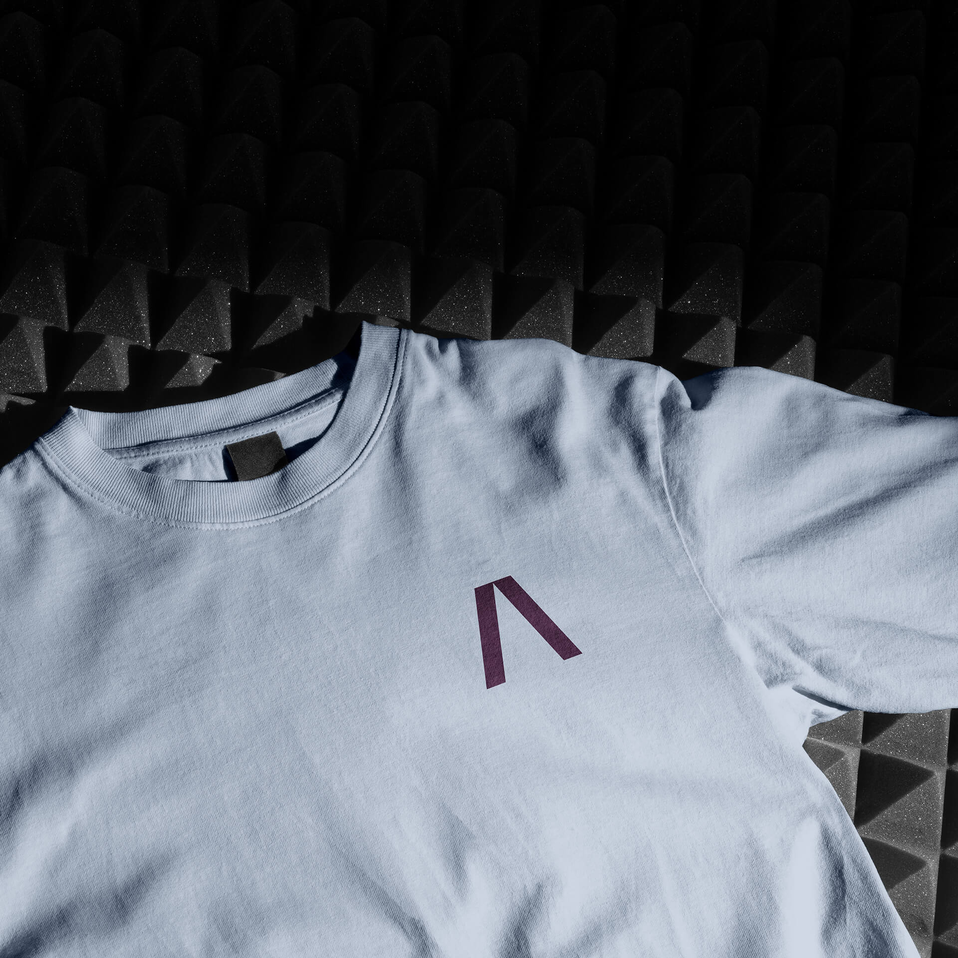
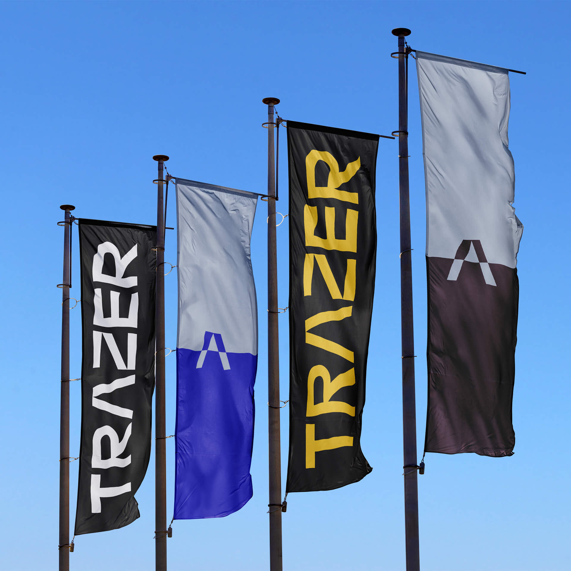
The Trazer symbol originates from the "A" glyph in the wordmark. When isolated, it depicts a road extending towards the horizon, reflecting the viewpoint of those inside a car.
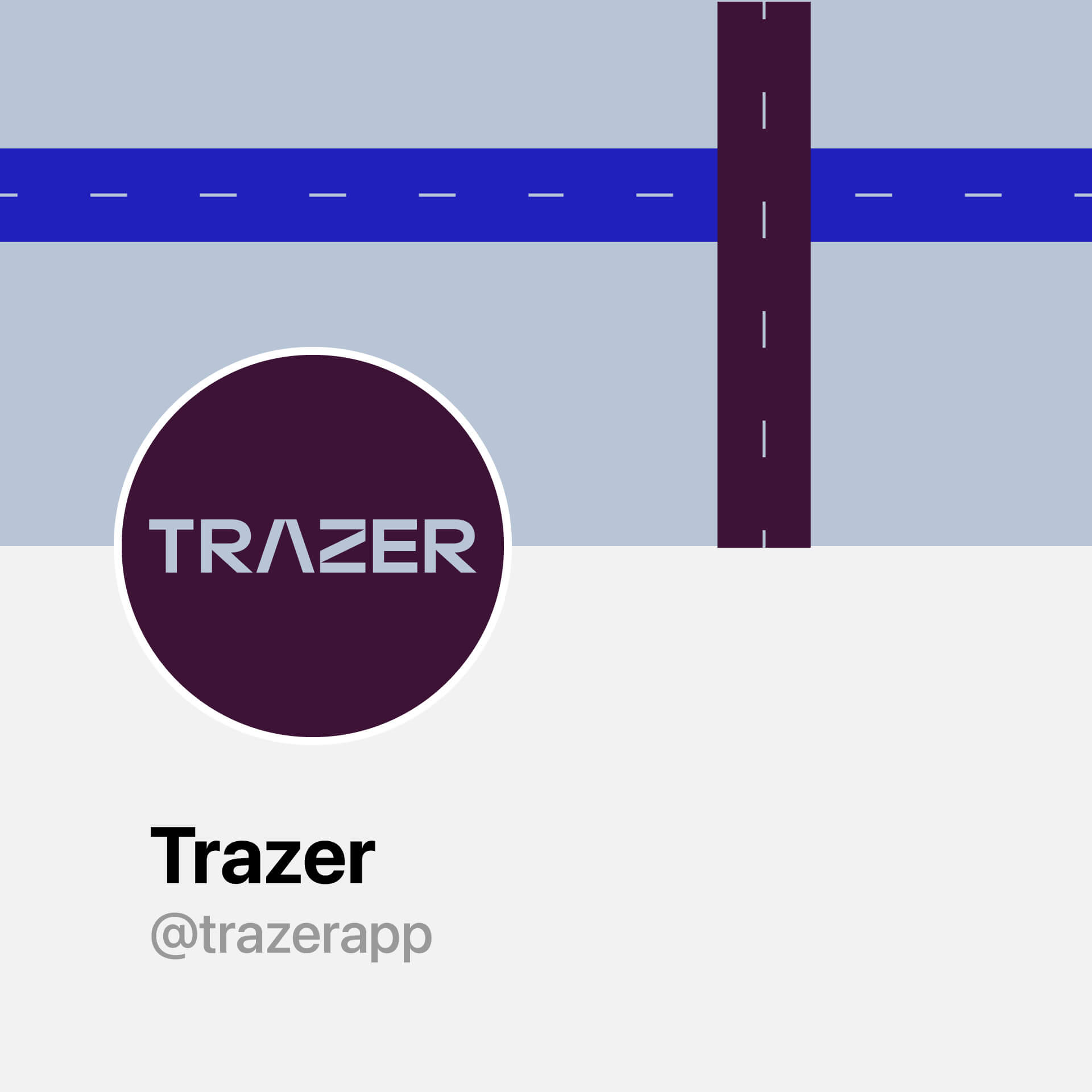
Alternatively, the "Z" glyph is also modified to operate independently as a secondary mark, representing an aerial view of a road intersection.
-
![Trazer]()
-
![Trazer]()
-
![Trazer]()
-
![Trazer]()
-
![Trazer]()
-
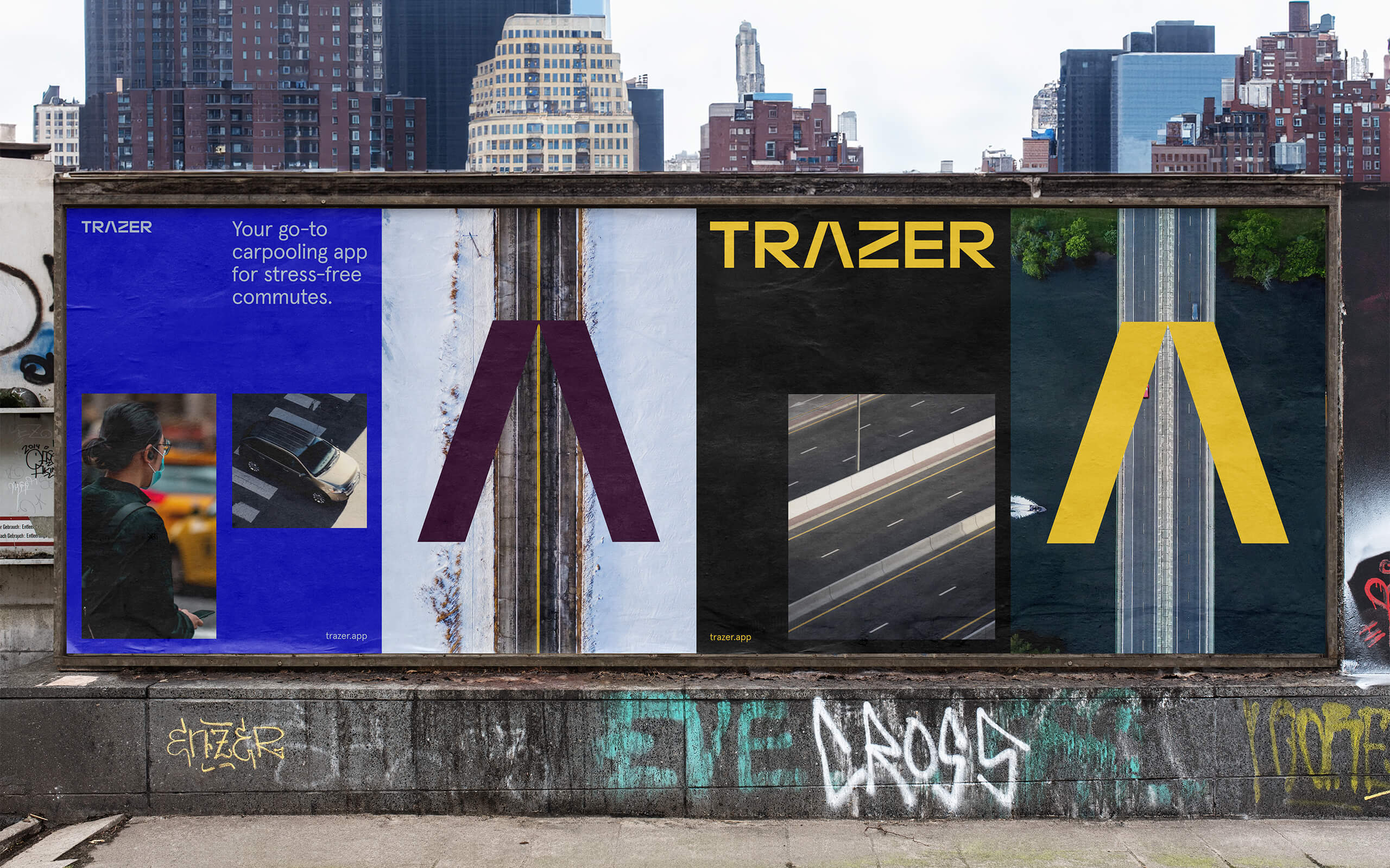
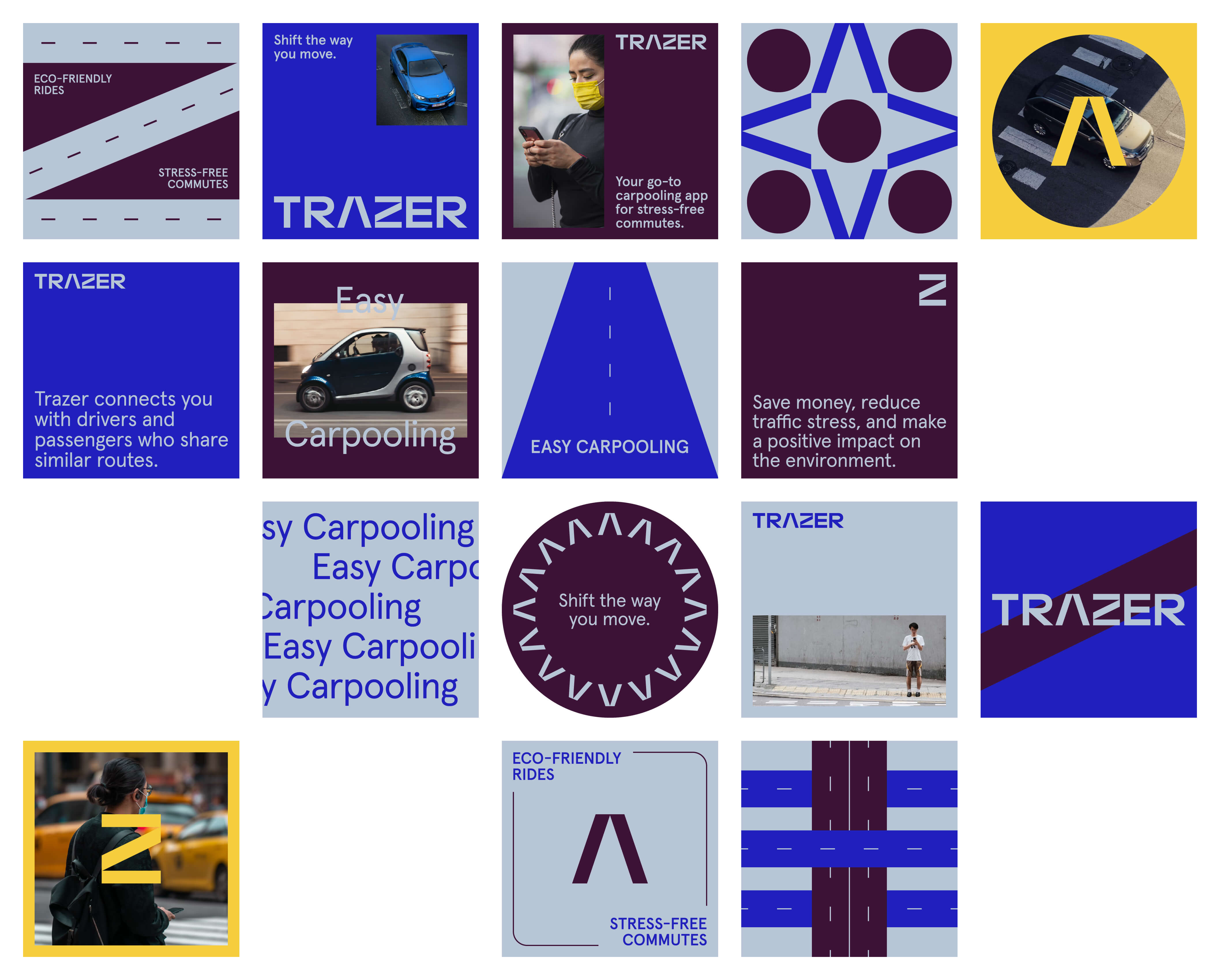
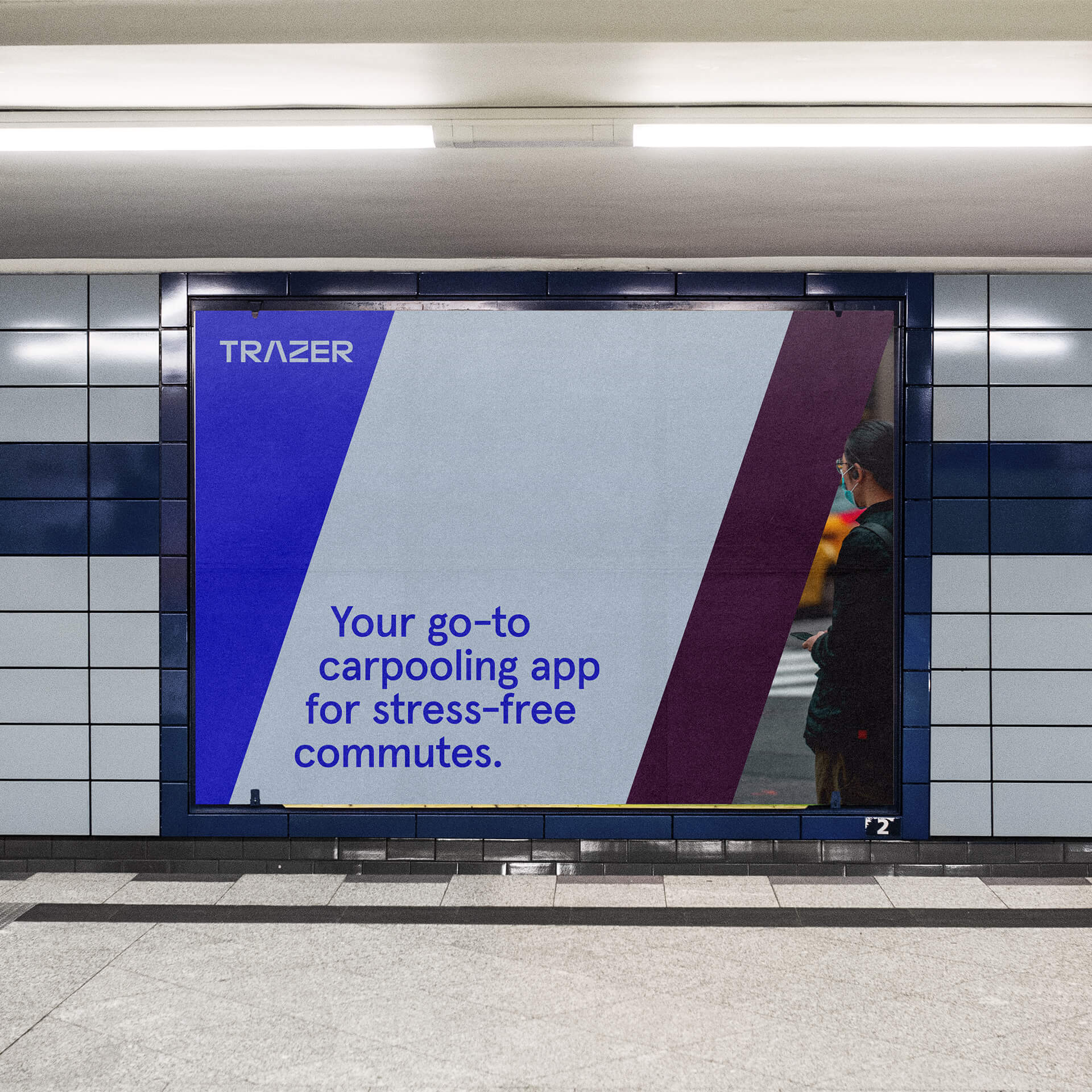
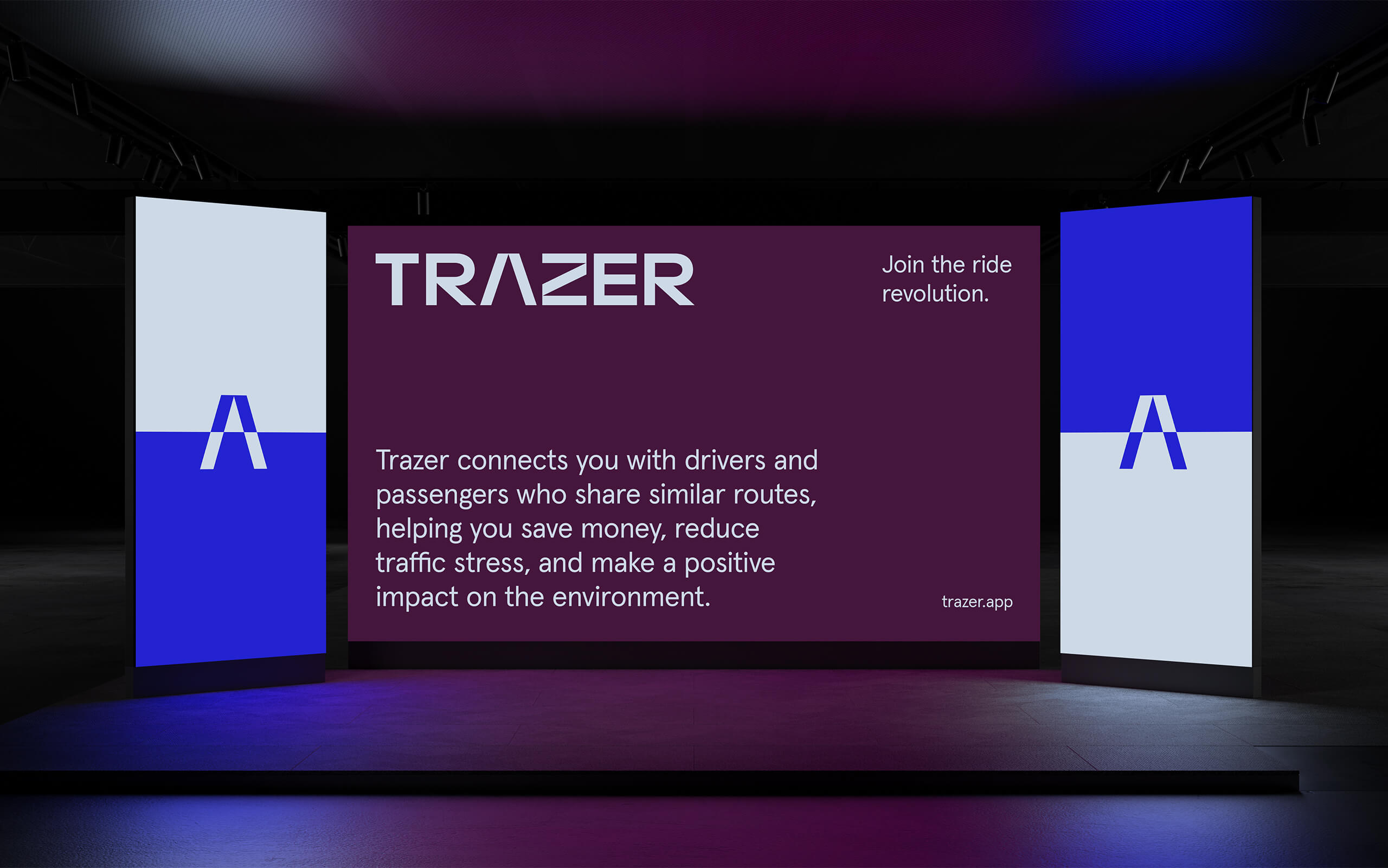
The art direction of Trazer is centered around a sleek, modern aesthetic that aligns with its mission to revolutionize urban mobility. The design incorporates clean lines and minimalist elements, reflecting the app's focus on efficiency and sustainability
Imagery within the app features urban landscapes and dynamic, real-life scenarios where users engage with the app, emphasizing practicality and ease of use. Overall, Trazer's art direction combines modern design principles with subtle references to its core functionality, creating a visually appealing and cohesive brand identity.
-
![Trazer]()
-
![Trazer]()
-
![Trazer]()
-
![Trazer]()
All Projects ↓
