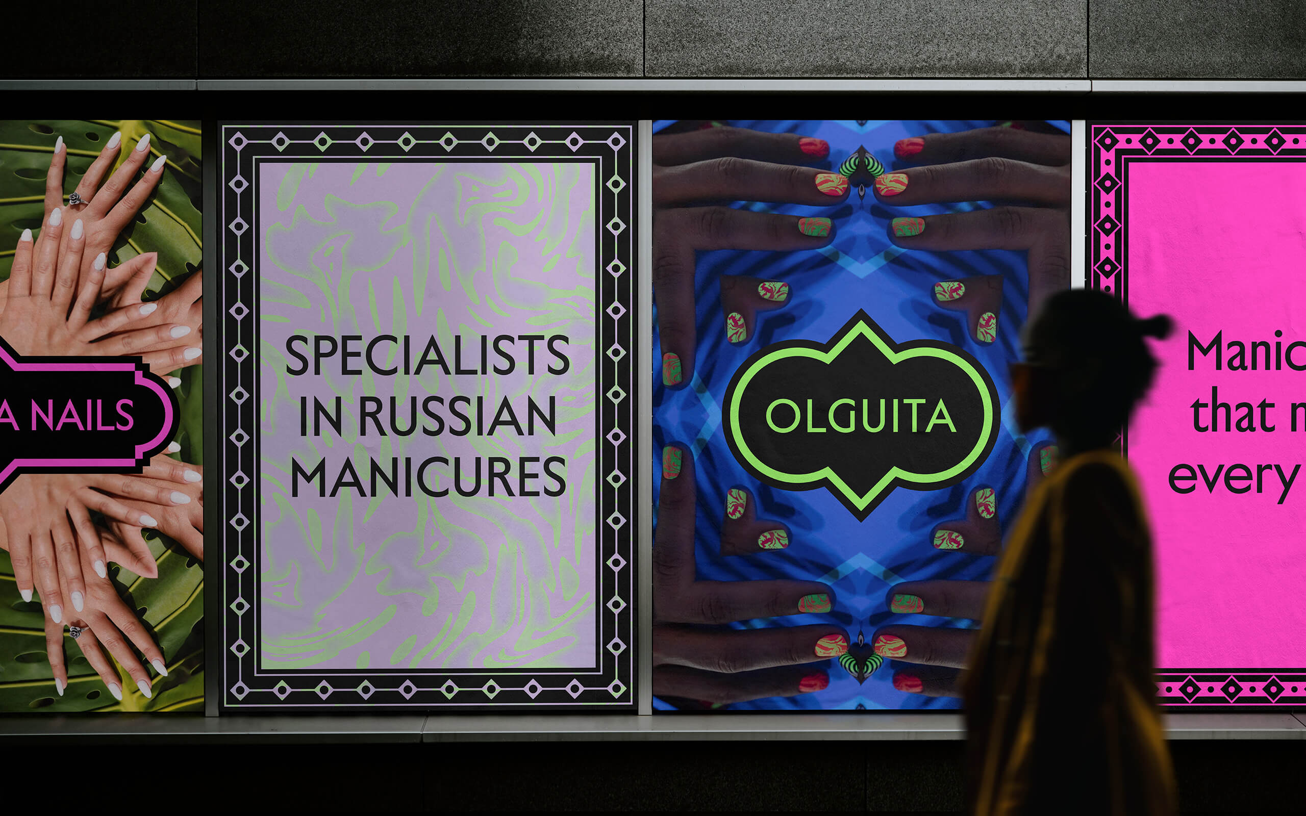
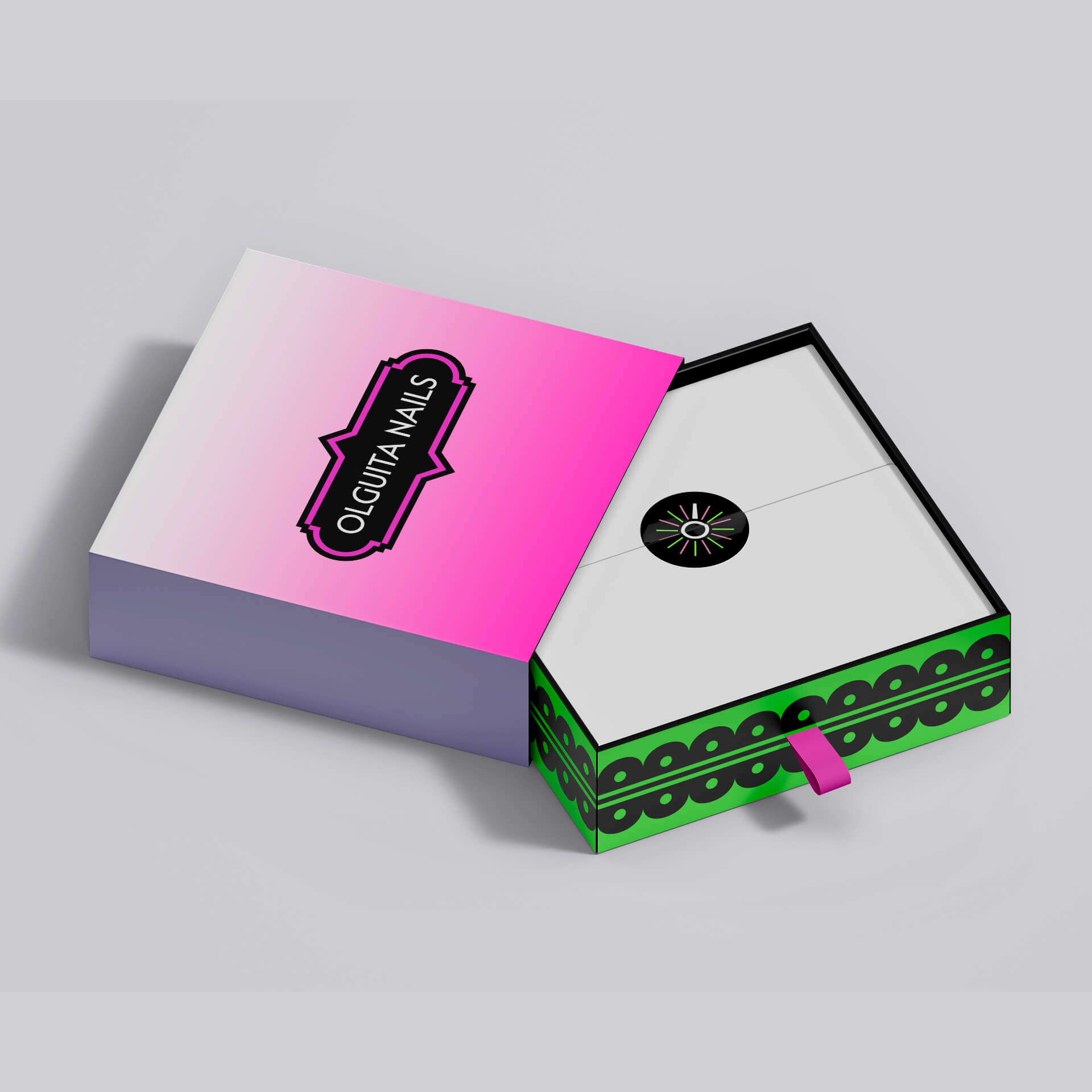
Olguita Nails is a manicure salon and academy located in Vigo, Spain. Specializing in Russian manicures, their technicians stay updated with the latest design trends and nail art techniques, ensuring clients receive the most current and stylish services available. The academy also offers specialized training for aspiring nail technicians focusing on both technical and creative skills.
- Brand
- 2023
-
![Olguita Nails]()
-
Russian manicure is a meticulous and delicate technique that only professional manicurists trained in it are capable of performing. Instead of using traditional files, the Russian manicure requires a drill for the filing process and to shape the nails precisely.
-
Named Russian because the technique originated there, and with Olguita Nails' managers and technicians being native Russians, I decided to align the branding with that theme.
-
![Olguita Nails]()
-
![Olguita Nails]()
-
![Olguita Nails]()
-
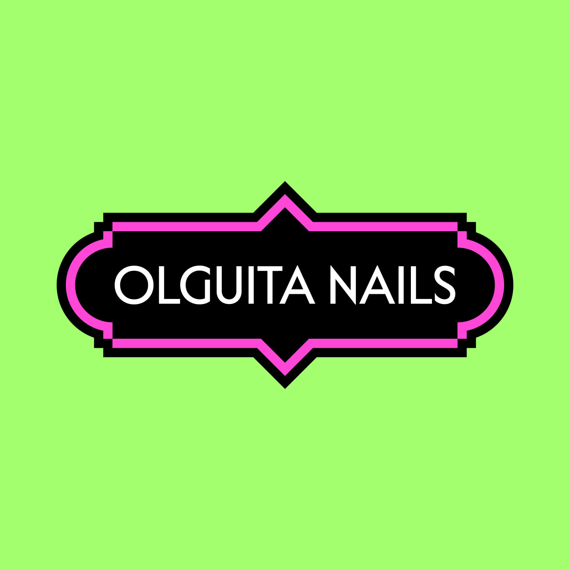
Different variations of the logo have been created to align with the business segments, including the salon, academy, and product line. This ensures each branch has a distinct yet cohesive visual identity, enhancing brand recognition and customer engagement.
Avoiding the hackneyed use of Russian or Cyrillic-inspired typefaces, and opting instead for an elegant sans-serif close to Futura, the use of Russian evocative geometric shapes provides a subtle but noticeable geographic reference.
-
![Olguita Nails]()
-
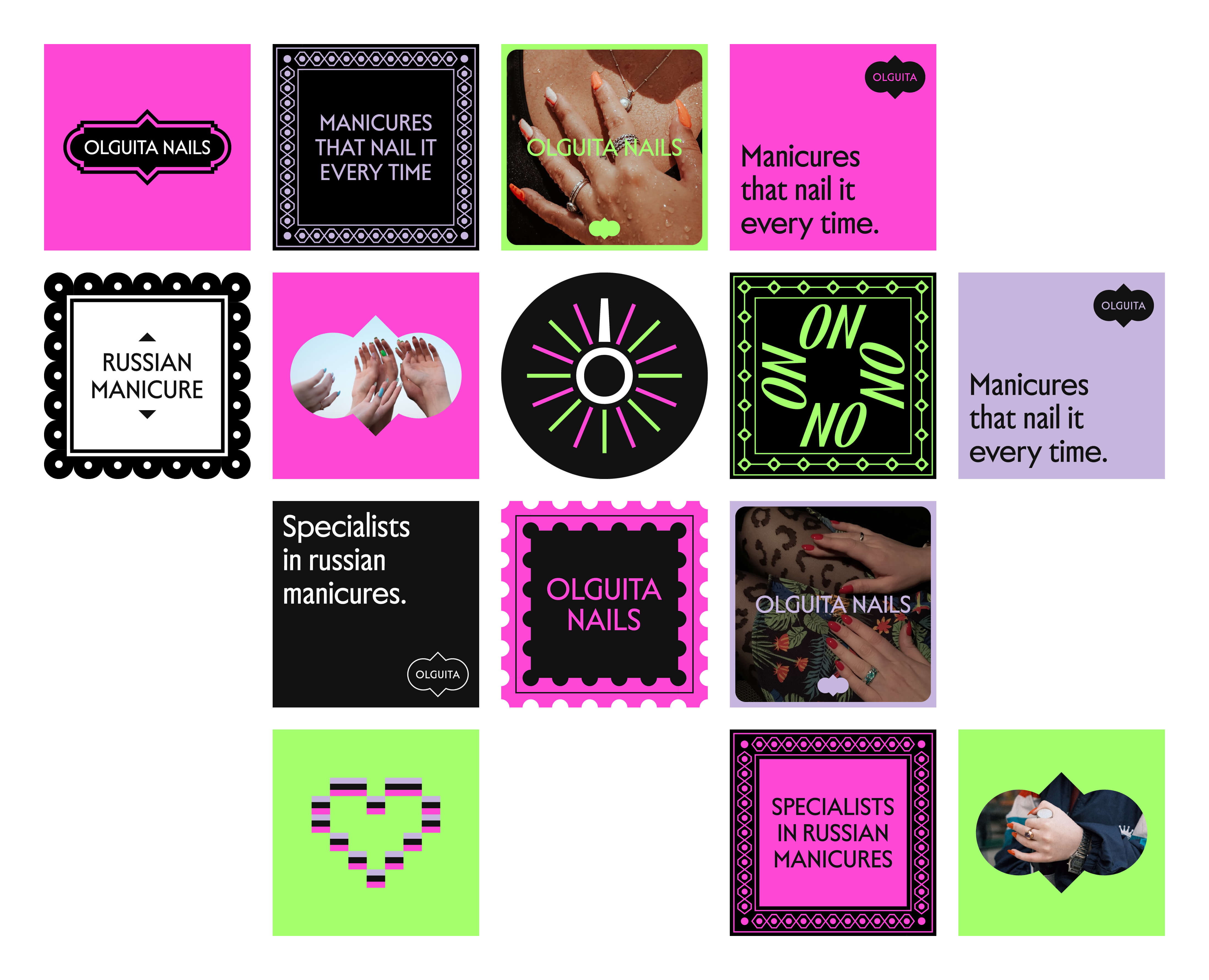
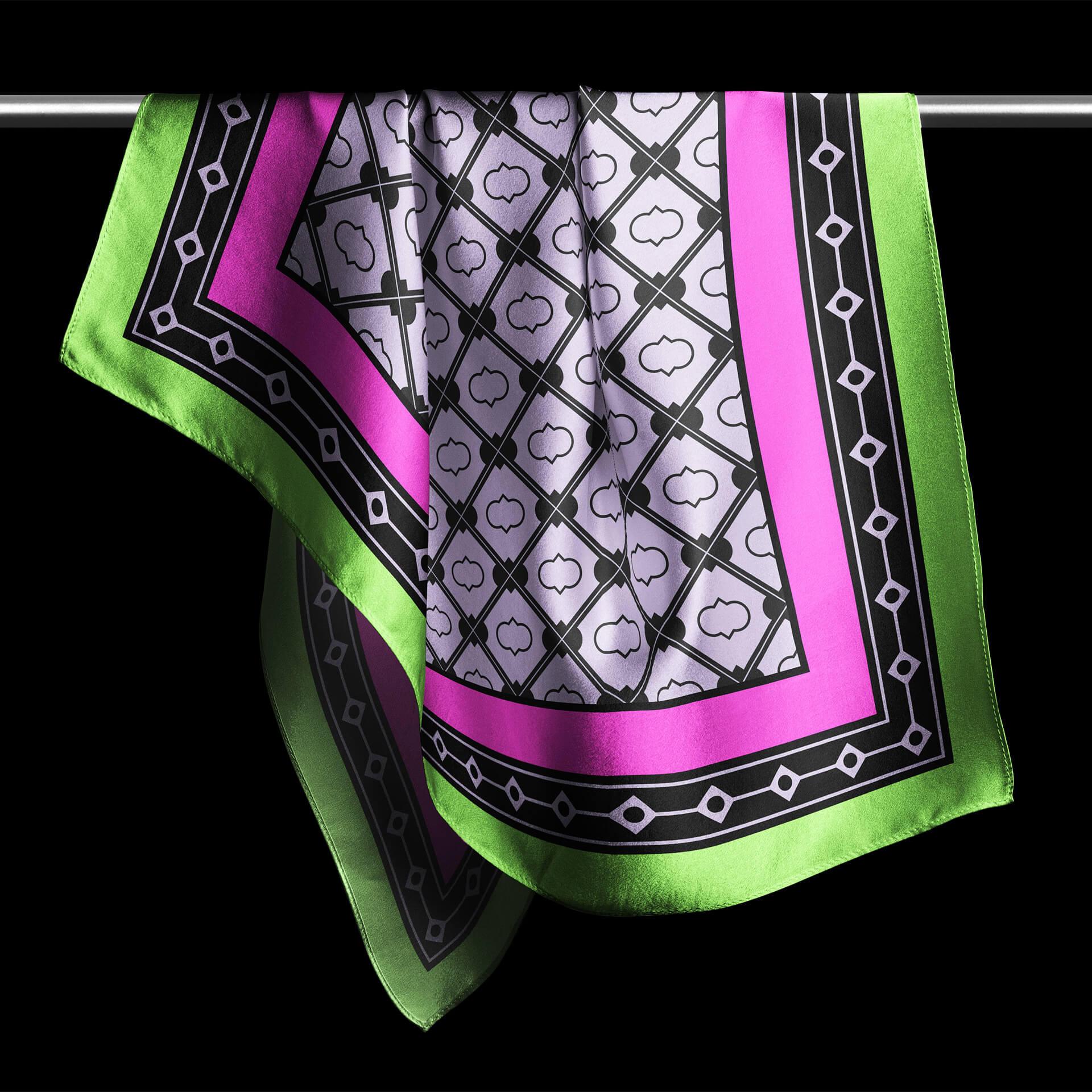
The branding's art direction features modern interpretations of traditional geometric patterns found in Russian folklore. Providing branding with a valuable visual resource, as well as recognizable and full of meaning, these patterns serve as the cornerstone upon which the art direction is built.
-
![Olguita Nails]()
-
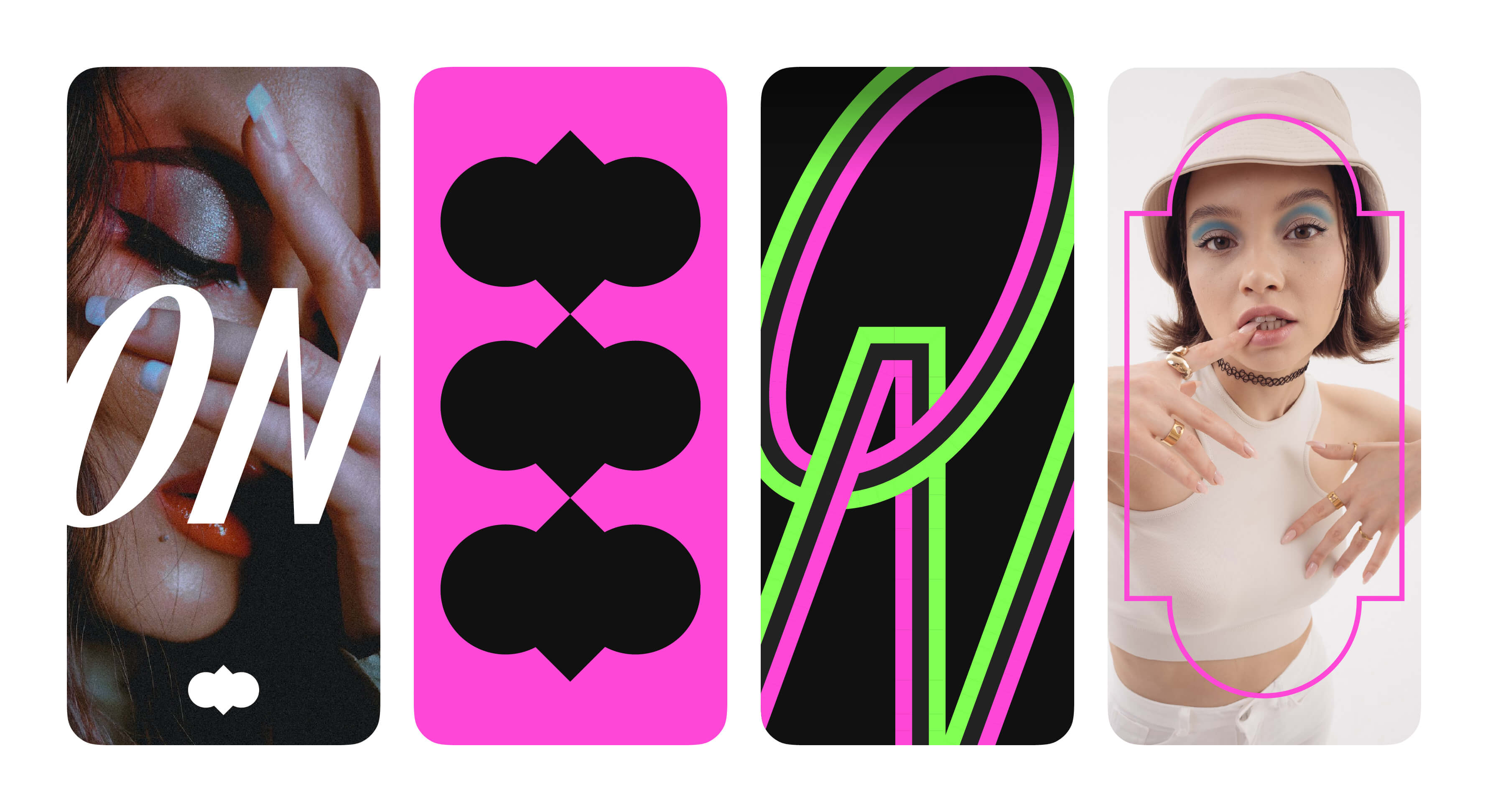
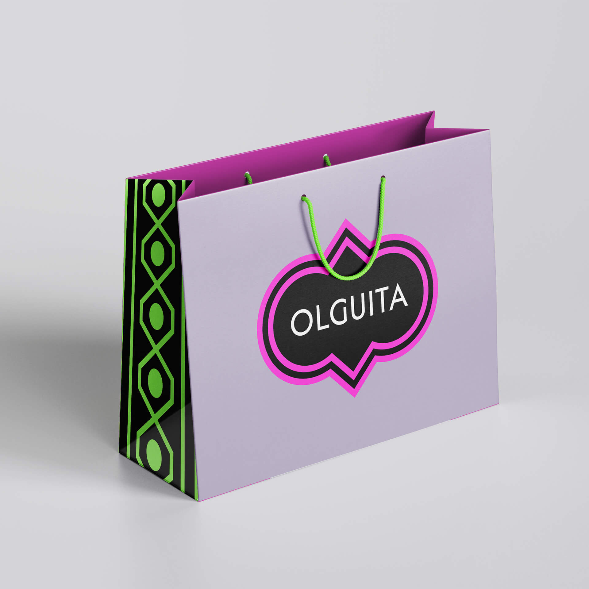
The logotypes' recognizable silhouettes are used as isolated elements, transforming them into an essential graphic component of the branding. This silhouette shapes can be utilized as masks to hold images and as miniature versions of the primary logotype.
-
![Olguita Nails]()
-
![Olguita Nails]()
-
The colour palette has an overall delicate and fresh feel, creating a soothing and inviting aesthetic. However, it is also versatile enough to accommodate bold and vibrant color combinations when needed.
This flexibility allows the branding to adapt to different contexts, ranging from subtle elegance to energetic and eye-catching displays.
-
![Olguita Nails]()
-
-
![Olguita Nails]()
-
![Olguita Nails]()
-
-
![Olguita Nails]()
-
![Olguita Nails]()
All Projects ↓
